What you can put on a board
A plain guide to every kind of item on a MockFlow board: components, sticky notes, frames, sections, shapes, drawings, connectors, embeds, artifacts and comments, and when to use each.
Everything you place on a MockFlow board is an item. A sticky note is an item, and so is a kanban board, a flowchart, a video or a small app the whole team plays. Every item sits on the same visual canvas, so you can move it, resize it, connect it to other items and edit it in place.
This guide explains each kind of item in plain terms: what it is, when to use it and where to find it.
Every kind of item at a glance
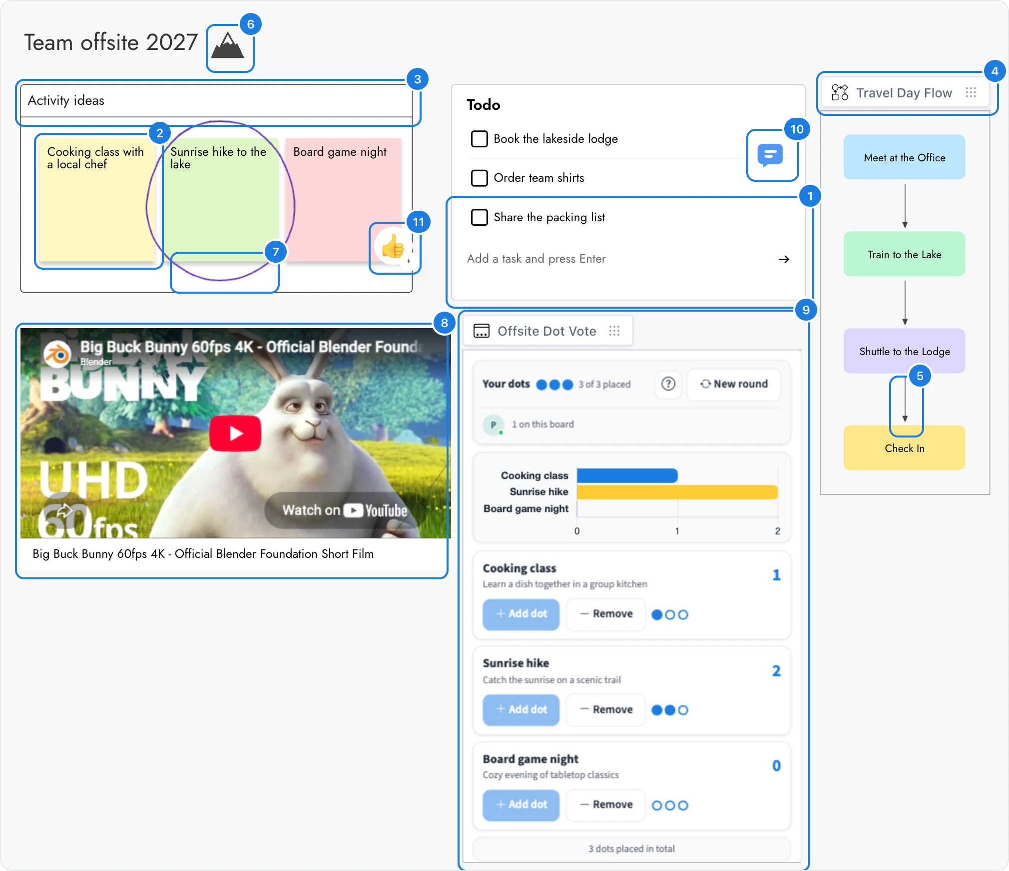
The board below holds one of each kind of item, for planning a team offsite.
# | Item | What it is | Example on this board |
|---|---|---|---|
1 | Component | A ready-made tool for one job | The Todo checklist of tasks before the trip |
2 | Sticky note | A small colored note for one idea | Activity ideas from the team |
3 | Section | A titled area that holds and moves items together | The Activity ideas area around the notes |
4 | Frame | A ready area for one kind of work | The Travel Day Flow diagram |
5 | Connector | A line or arrow that joins two items | The arrows between the travel steps |
6 | Shape, icon or sticker | A graphic from the Assets panel | The mountain icon beside the title |
7 | Drawing | A freehand stroke | A circle around the favorite idea |
8 | Embed | Live content from another website | A YouTube video playing on the board |
9 | Artifact | A small app or game built with AI | Offsite Dot Vote, where everyone votes on an activity |
10 | Comment | Feedback pinned to an exact spot | A question about the lodge booking |
11 | Reaction | A quick emoji response | A thumbs up on an idea |
The sections below explain each one.
Where you add each kind of item
Most items come from the tool bar at the bottom of the board.

Add anything (Ctrl+2): components, frames and artifacts, from the full library.
Assets: shapes, icons, stickers and the files you uploaded.
Frames: ready areas for one kind of work.
Draw (Ctrl+5): freehand drawing.
Stationery (Ctrl+6): sticky notes, sticky tags, note stacks, sections and text.
Comments and reactions come from Comments at the top right of the board. Shortcuts use Ctrl; on a Mac, use ⌘. For step by step instructions, see Build your board.
Components: ready-made tools for any kind of work
A component is a ready-made tool that does one job on the board. Each one already knows how to behave: a checklist ticks off tasks, a kanban board moves cards between columns, and a chart draws itself from the numbers you enter.
The component library groups components by kind of work, such as:
Kind of work | Example components |
|---|---|
Planning and productivity | Kanban Board, Gantt Chart, Timeline, Calendar, TODO or Checklist |
Ideas and thinking | MindMap, Knowledge Graph, Storyboard, Customer journey map |
Data | Table, Spreadsheet, bar, line and pie charts |
Writing and reference | Document, CodeBlock, PDF viewer |
Places | Pin Maps, Region Maps, Strategy Map |
Design | Color code, Font preview, Image |
Working together | Poll, Upvote ideas, Spinning Wheel |
A teacher might add a timeline of a history unit, a marketing team a content calendar, and a product team a kanban board for the next release. New components are added to the library regularly, so search it for what you need.
Many components are interactive: you click inside them to tick a task, vote in a poll or move a card. Double click a component to work inside it, or switch the board to Play mode (Ctrl+P) to use every component at once.
Sticky notes, sticky tags, note stacks and text
These are the items you add most when you brainstorm. They are all in Stationery (Ctrl+6).
Item | What it is for |
|---|---|
Sticky note | One idea per note, in a color you choose. Press N to add one. |
Sticky tag | A small colored flag to mark or bookmark an item. |
Note stack | A pad of sticky notes. Drag a fresh note off the stack whenever you need one. |
Text | A label or heading anywhere on the board. Press T to add one. |
Use sticky notes for quick ideas in a workshop, a retro or a lesson, and text for titles and labels that explain the board.
Sections: group items that belong together
A section is a titled area that holds the items placed on it. When you move a section, everything inside moves with it. Use sections to divide a board into parts, such as one section per workshop exercise, per week of a course or per campaign channel.
Press S to add a section, or select a few items and choose Wrap in Section to put a section around them. A section can also stack its items in a neat row or column. See Sections for everything a section can do.
Frames: ready areas for one kind of work
A frame is a ready area set up for one kind of work, with its own tools for that work. The Frames button in the tool bar lists them in three groups:
Group | Frames | Good for |
|---|---|---|
Brainstorm frames | Diagram, SiteMap/Org/Tree, Whiteboard, Section | Flowcharts, org charts, sitemaps and brainstorming with sticky notes |
Design frames | Wireframe, Prototype, Design frame, Moodboard, Floor Plan | App and web screens, clickable prototypes, social posts and posters, visual references and room layouts |
Interactive frames | Artifact, Data Simulator | Mini apps and games, and live what-if models with charts and sliders |
Most frames show their name on a small label at the top left. Drag the label to move the frame. Many frames can also generate their content with AI: the diagram on the example board was made from one sentence describing the travel day.
Frame or section? A section is a simple container for any items. A frame is built for one kind of work and comes with the tools for it, such as diagram shapes in a Diagram frame or device sizes in a Wireframe.
Shapes, icons, stickers and uploads
The Assets panel holds graphics and files:
Shapes: general, sketchy and 3D shapes, plus shape sets for diagrams such as cloud architecture, networks, UML and science.
Icons: icon sets such as Material, Bootstrap and Font Awesome, plus emojis and sketchy icons.
Stickers: illustrated sticker packs to add personality to a board.
Uploads: files from your computer. Drag a file onto the board, paste an image, or use Upload from computer in the panel.
An uploaded file becomes the right kind of item: a picture becomes an image, a PDF opens in a PDF viewer, a video or audio file gets a player, and a GLB file becomes a 3D model you can turn around. The board accepts JPG, GIF, PNG, SVG, WEBP, PDF, WebM, MOV, MP4, MP3 and GLB files, up to 50 MB each.
Drawings
Draw (Ctrl+5) lets you draw freehand on the board with a pen, a straight line tool or a semi transparent marker, in any color and thickness. Each stroke becomes its own item, so you can move or delete one stroke without touching the rest. Use drawings to circle a favorite idea, sketch a quick layout or annotate a screenshot.
Connectors: show how items relate

A connector is a line or arrow that joins two items. It stays attached when you move either item, so a flow keeps its shape as you rearrange it.
To draw one, select an item and drag from one of the small arrows on its sides to another item.
Connectors can be straight, curved or stepped, solid, dashed or dotted, with arrowheads, a label and even an animated flow. Use them for flowcharts, mind maps, user journeys and any idea that leads to another.
Embeds and link cards: content from other websites
Paste a link on the board to bring in content from another website:
Embed: a link from a supported service plays or opens right on the board, such as a YouTube or Vimeo video, a Figma file, a Google Doc, Sheet or Slides deck, a Spotify playlist or a Loom recording.
Link card: any other web address becomes a card that shows the page's title and image, with a link to open it.
Use embeds to keep reference material next to the work, such as a product video beside a storyboard or a lesson video beside a worksheet. Choose Enter Focus Mode on an embed to view it large.
Artifacts: apps and games built with AI
An artifact is a small working app or game that AI builds from a description, such as dot voting, a quiz, planning poker, a timer or a word game. Everyone on the board uses the same artifact at the same time, and its votes, turns and scores stay in sync for all.
Open Add anything (Ctrl+2) and choose the Artifacts tab to browse the library, or choose Create your own artifact and describe what you need.
Artifacts come with the Plus and Max plans. Creating your own artifacts and publishing them to your team library needs the Max plan. See MockFlow pricing.
Comments and reactions
Comments and reactions are feedback you pin to the exact spot you mean. Click Comments at the top right of the board, then drag one onto the board.
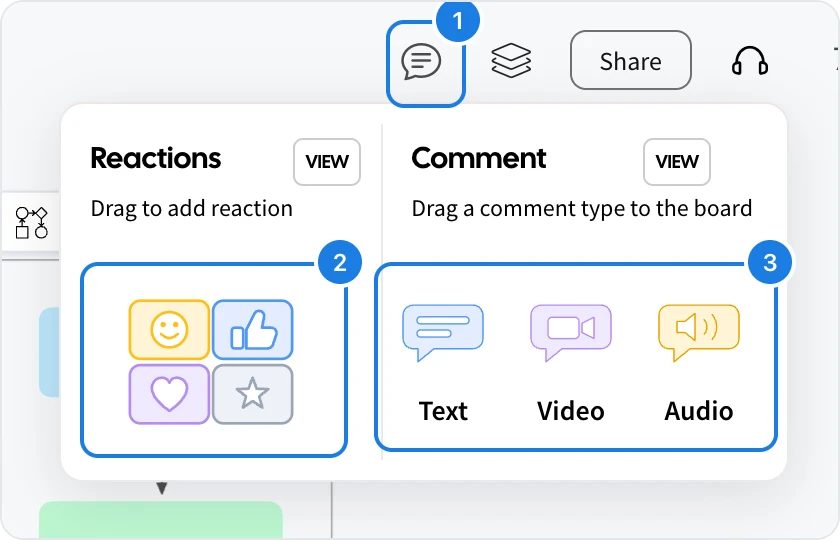
Comments: opens the menu.
Reactions: drag a reaction onto the item you are responding to.
Comment types: drag a Text, Video or Audio comment onto the spot you want to discuss.
The four kinds of feedback:
Reaction: a quick emoji response, such as a thumbs up on an idea.
Text comment: a written note with replies, so a conversation stays next to the work.
Audio comment: a spoken note, for feedback that is quicker to say than to type. Plus
Video comment: a recorded video message, for a walkthrough or a detailed review. Max
Which item should I use?
You want to | Use |
|---|---|
Capture a quick idea | A sticky note |
Divide the board into parts | A section |
Draw a flowchart, org chart or wireframe | A frame, such as Diagram, SiteMap/Org/Tree or Wireframe |
Track tasks, dates or data | A component, such as a checklist, calendar or chart |
Show how ideas connect | Connectors |
Mark up or sketch freely | A drawing |
Bring in a video, document or design file | An embed, by pasting its link |
Run a vote, quiz or game together | An artifact, or a component such as Poll |
Ask a question about one spot | A comment |
How many items a board can hold
On the Basic plan, a board holds up to 500 items. Every item counts, including connectors, drawing strokes, comments and reactions. The Plus and Max plans have no item limit. See MockFlow pricing.