
Create and share your own UI packs
Turn your own components into a custom UI pack in WireframePro, merge packs, and share them with your team.
A custom UI pack holds your own components, such as your product's header, a pricing card or a school portal's homework list, so you and your team can drag them into any project. It works like a lightweight design system for wireframes.
Create a pack
Click Change UI pack at the top of the components panel, then click + (Create a Component Pack).
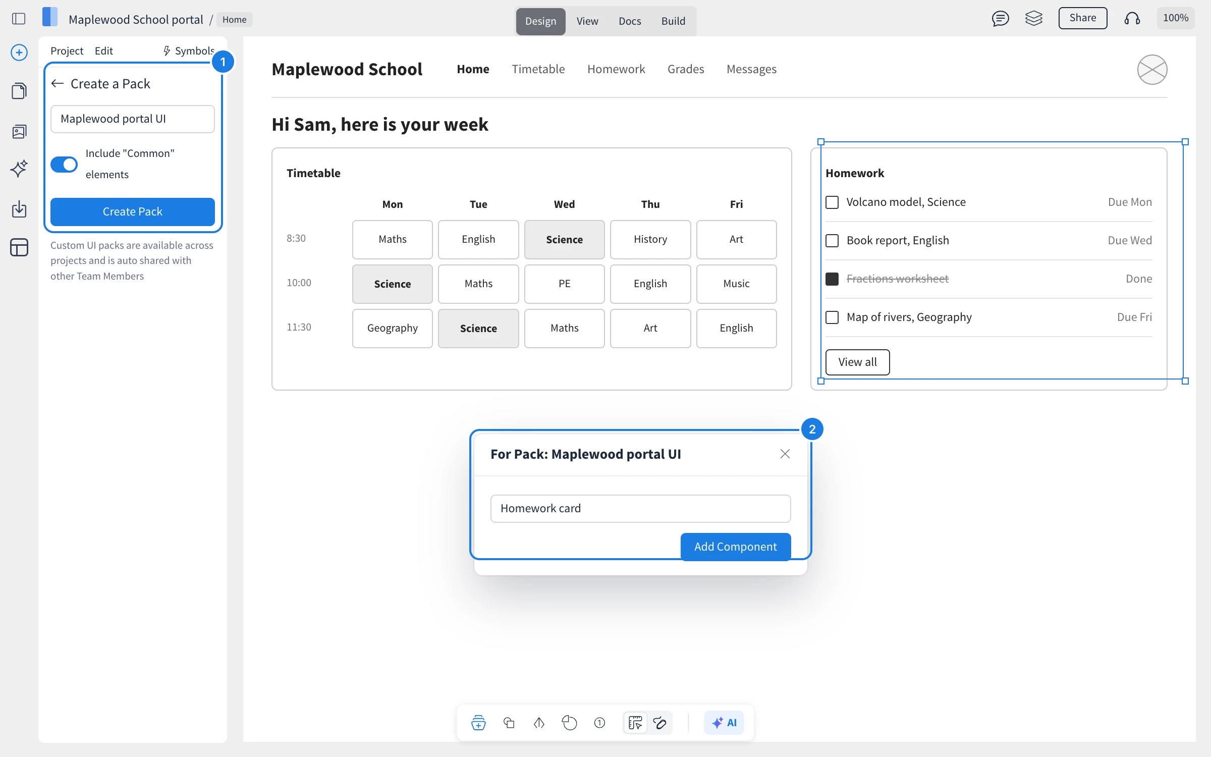
In Create a Pack (1), enter a name for the pack.
Leave Include "Common" elements on to keep basic items, such as text and rectangles, in the pack, or turn it off.
Click Create Pack.
Add your own components
On a page, select the items that make up the component, for example a homework card.
Click Add Component to Pack at the bottom of the components panel, or right-click the selection and choose Save as Component.
Enter a name (2) and click Add Component.
The component appears in the pack, ready to drag onto any page.
Merge and organize packs
Merge UI Pack lists several UI packs in a single pack, so one search covers them all. Name the merged pack and click Create Pack.
Organize Pack sorts your packs.
Edit pack renames a pack, links it to a design skill for AI generation, or deletes it.
Share a pack with your team
Custom UI packs are available across your projects and are shared automatically with team members who have a valid license on your team. You can also share a pack with the MockFlow community through Share pack.
What is not available on the Basic and Plus plans
Custom team UI packs and cloning UI packs are part of the Max plan. Max also includes many other features, such as Build mode and Figma export. See MockFlow pricing for details.