
Design screens with UI kits and components
Build WireframePro pages from UI kits such as iOS, Android, Material, Bootstrap and Shadcn, search components, and add icons, images, shapes and templates.
In WireframePro you design a page by placing components: buttons, inputs, tables, tab bars, cards and many more. Components come in UI packs, so a phone screen can use iOS controls, an admin dashboard Bootstrap or Shadcn, and an early concept a sketchy, hand-drawn look.
Add components to a page
Click Add components on the left rail, or press Ctrl (⌘ on Mac) + 2. The panel shows the components of the current UI pack.
Drag a component onto the page, or double-click it to add it.
To find a component quickly, press Ctrl (⌘ on Mac) + K and type its name, for example date picker or tab bar.
If a search finds nothing in the current pack, the panel suggests checking the other packs.
Switch to another UI pack
Click Change UI pack at the top of the panel and pick one of your packs. WireframePro comes with packs such as Common, Website, Sketchy Web UI, Sketchy Mobile UI, Charts, iPhone iOS, iPadOS, Android, Material 3, Bootstrap 5, Tailwind, Shadcn, Windows 11, macOS, Browser Frames and Maps.
Add more UI kits
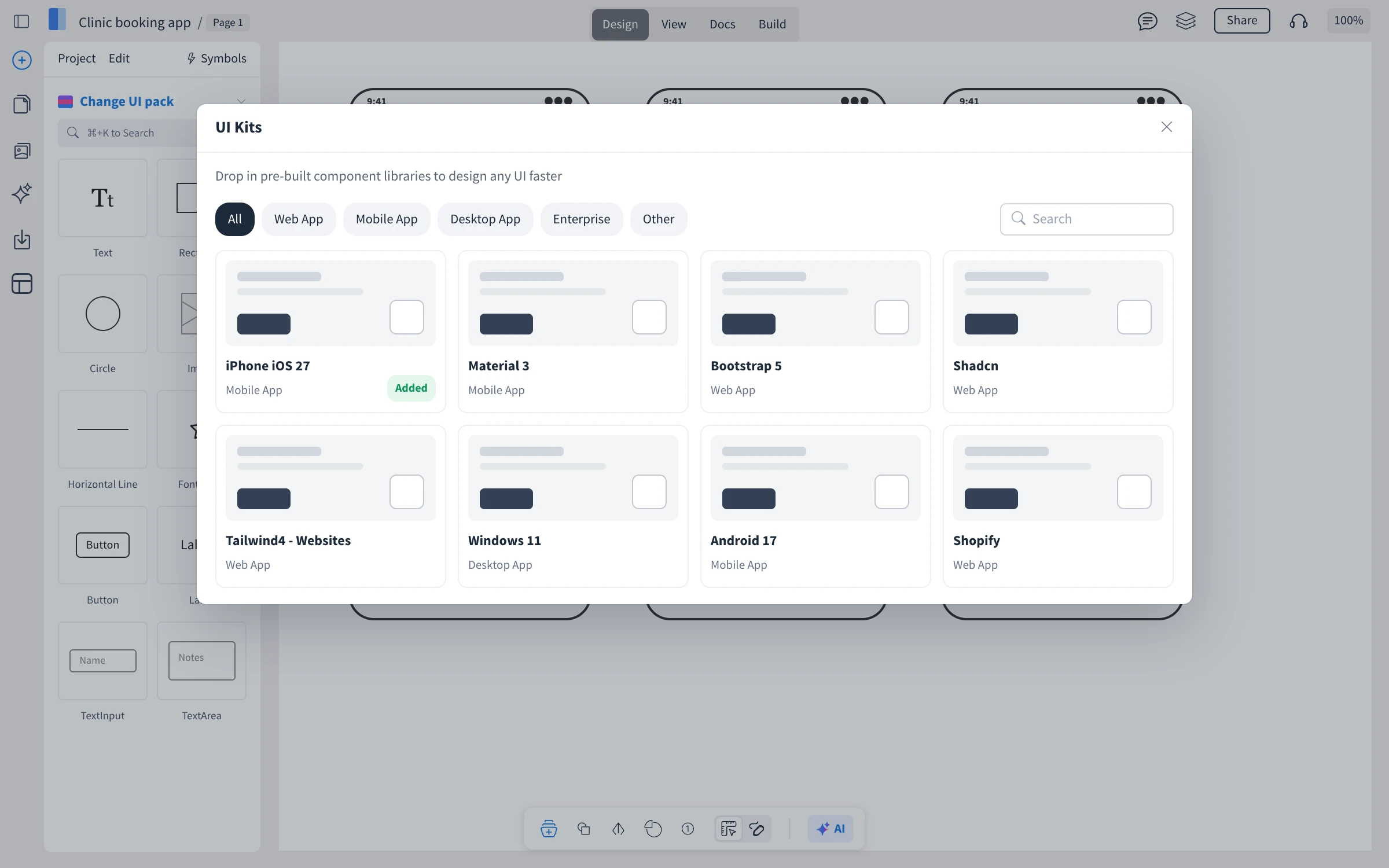
To add a kit to your list, click Change UI pack, then Add More Packs. The UI Kits window shows kits by category: Web App, Mobile App, Desktop App, Enterprise and Other, with search. Click a kit to add it. MockFlow confirms with UI Kit added! and switches the panel to the new kit. Kits you already have show Added.
Add icons, images, shapes and templates
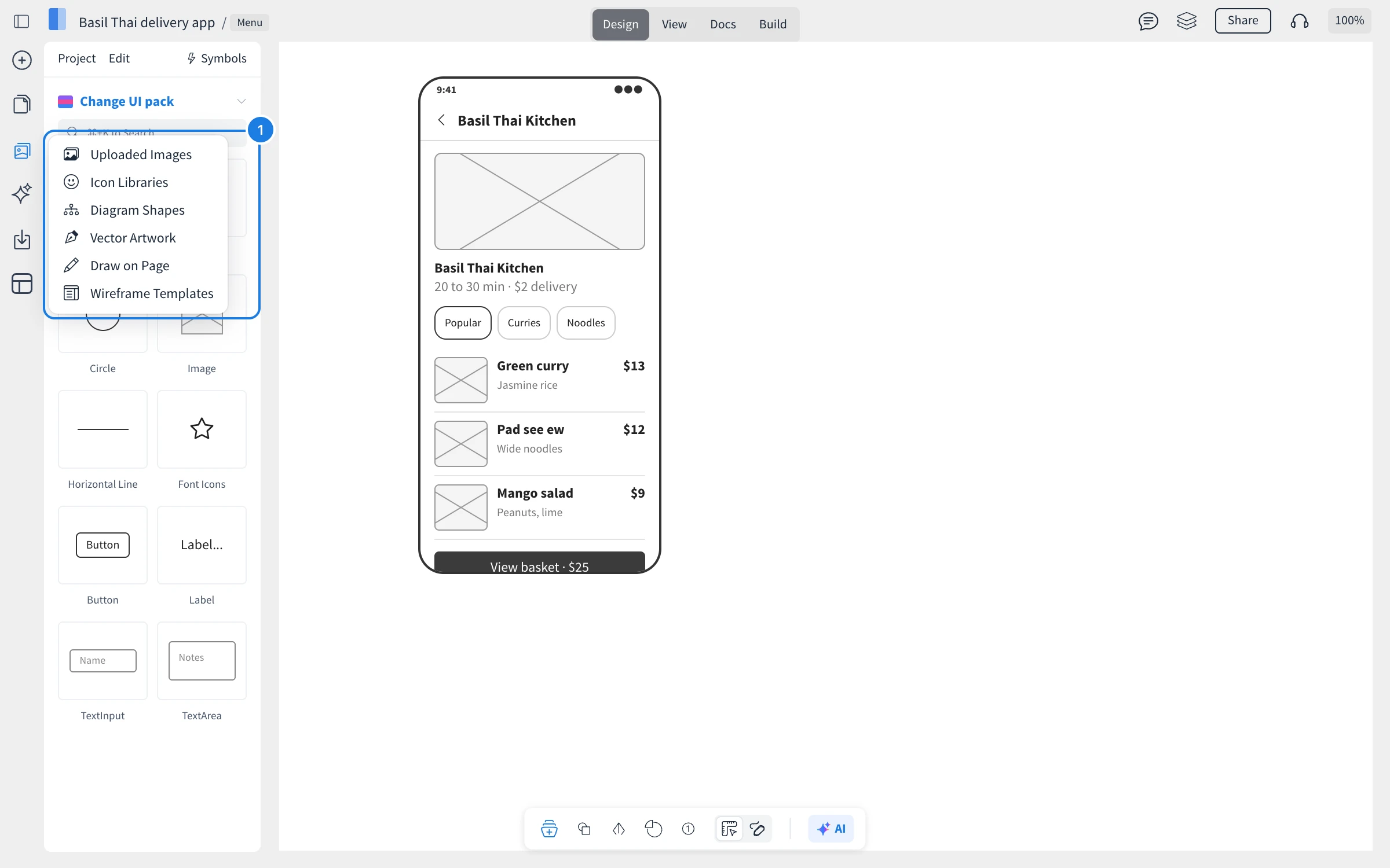
Click Assets on the left rail (1) for everything that is not a UI component:
Uploaded Images: your own images, such as a logo or product photos.
Icon Libraries: icons to place on any page.
Diagram Shapes: shapes for flows and annotations next to your screens.
Vector Artwork: illustrations for empty states and onboarding screens.
Draw on Page: freehand drawing.
Wireframe Templates: ready-made page designs, also on the Templates button of the left rail, grouped as Websites, Web apps, Sketchy UI, Mobile apps, Desktop apps, UI Flows, Enterprise and more.
Switch between wireframe and sketchy components
The switch on the tool pill at the bottom toggles between Wireframe comps and Sketchy comps. Sketchy components look hand-drawn, which keeps feedback on structure rather than visual details in early reviews.