
Build your board
Add components, sticky notes, frames, templates and assets to a MockFlow board, then arrange, group and lock them.
Everything you place on a MockFlow board is a component: a sticky note, a mind map, a wireframe, a kanban board, a map or a chart. This article shows every way to add components and how to arrange them once they are on the board.
Shortcuts below use Ctrl. On a Mac, use ⌘ instead.
Ways to add to a board
Where | Shortcut | Best for |
|---|---|---|
Add anything in the tool bar | Ctrl+2 | Any component, from the full library |
Stationery in the tool bar | Ctrl+6 | Sticky notes, tags, sections and text |
Frames in the tool bar | A ready area for one kind of work, such as a wireframe or diagram | |
Assets in the tool bar | Ctrl+4 | Shapes, icons, stickers and your uploaded files |
Templates in the tool bar | Ctrl+3 | A ready-made layout to adapt |
Right-click on the canvas | Adding exactly where you clicked | |
AI in the tool bar | Ctrl+J | Describing what you need and letting Mida build it |
Add components from the library
The component library holds every component you can add to a board.
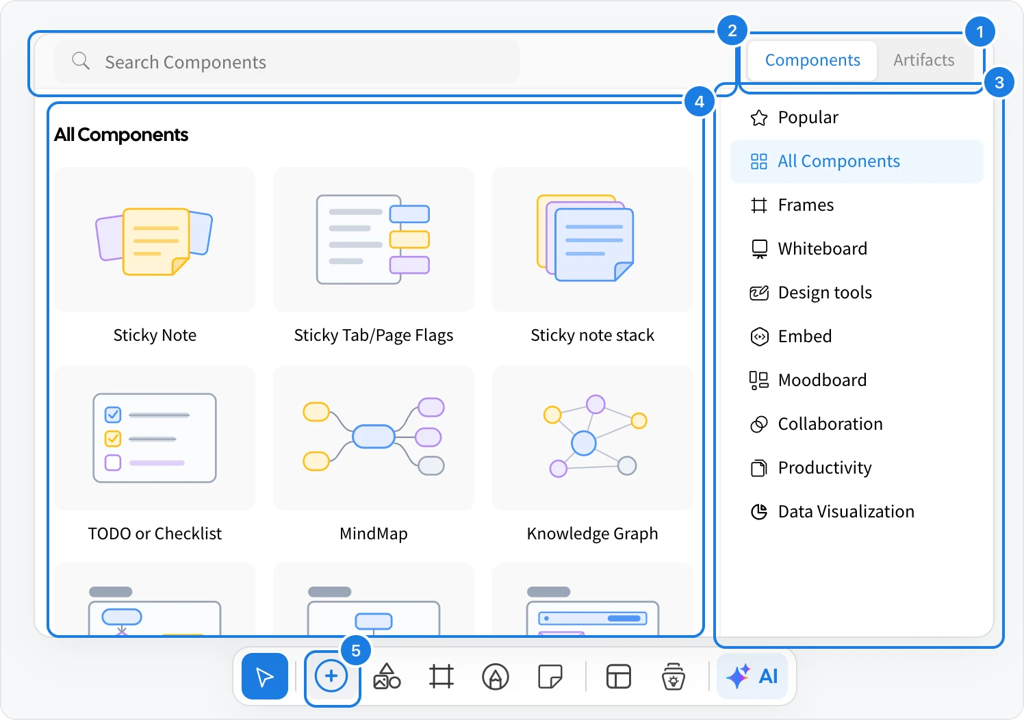
Click Add anything (5) in the tool bar, or press Ctrl+2.
Choose Components (1) for the full library, or Artifacts for apps and games built with AI.
Type in Search Components (2) to find a component by name or purpose, such as checklist, map or chart.
Or pick a category on the right (3). Components you used recently appear at the top of the list.
Click a component tile (4) to add it to the middle of your view, then drag it into place.
The categories group the library by kind of work, and new components are added to it regularly:
Category | What you find there |
|---|---|
Popular | The components used most, such as sticky notes, checklists and mind maps |
Frames | Ready areas for diagrams, wireframes, designs, moodboards and more |
Whiteboard | Sticky notes, shapes, arrows and other brainstorming items |
Design tools | Shapes, lines and images for laying out designs |
Embed | Videos, web pages, documents and other media |
Moodboard | Colors, fonts, images and media for visual references |
Collaboration | Items the team uses together, such as polls and votes |
Productivity | Planning and writing tools, such as kanban boards, timelines and documents |
Data Visualization | Charts, tables and graphs |
Artifacts are small apps and games that AI builds from a description, such as dot voting, speaker turns or a quiz. Everyone on the board uses the same artifact together, live.
Add sticky notes and text
Stationery (Ctrl+6) holds the items you add most when you brainstorm.
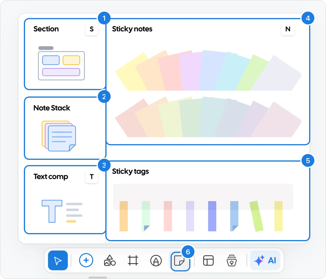
Section: a titled area that groups items. Press S.
Note Stack: a stack of sticky notes.
Text comp: a text box. Press T.
Sticky notes: click a color to add a note in it. Press N.
Sticky tags: colored tabs to flag items.
Click Stationery (6) in the tool bar to open the menu.
Add a frame
A frame is a ready area for one kind of work. Click Frames (4) in the tool bar.
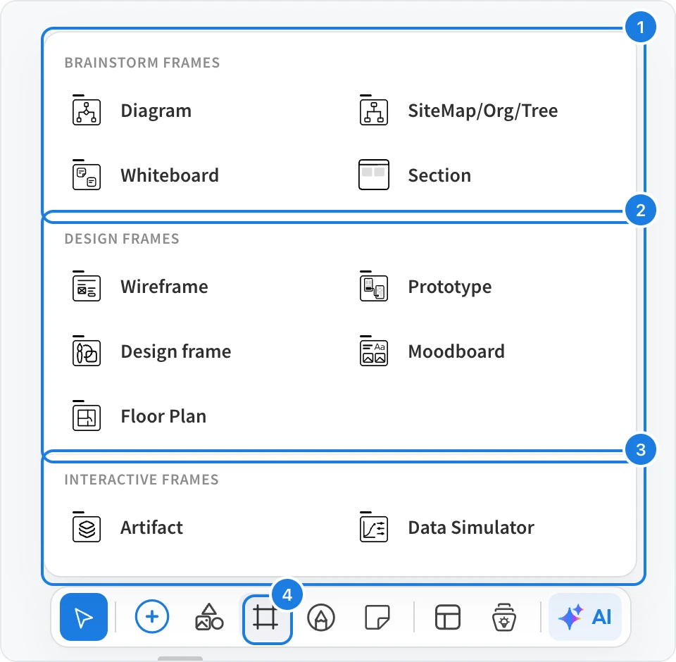
Brainstorm frames: diagrams, sitemaps and org charts, whiteboards and sections.
Design frames: wireframes, prototypes, designs, moodboards and floor plans.
Interactive frames: artifacts and data simulators.
Add shapes, icons, stickers and uploads
Click Assets (5) in the tool bar to open the assets panel.
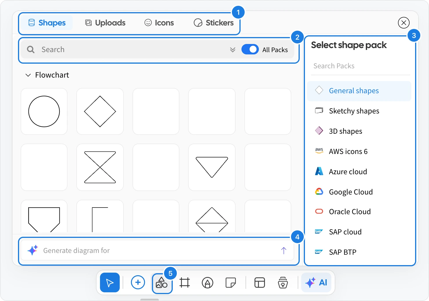
Shapes, Uploads, Icons and Stickers: switch between shapes, the files you uploaded, icons and stickers.
Search: find an item. Turn off All Packs to search the selected pack only.
Shape packs: general, sketchy and 3D shapes, and icon sets for cloud diagrams such as AWS, Azure and Google Cloud.
Generate diagram for: describe a diagram and let AI draw it with these shapes.
Add a template
Click Templates in the tool bar or press Ctrl+3, then choose a template to add its layout to the board. Templates cover brainstorming, design, diagramming, education, marketing, meetings, planning, research and strategy. Browse them all in the template library.
Add with a right-click
Right-click an empty spot on the canvas to add something exactly there.
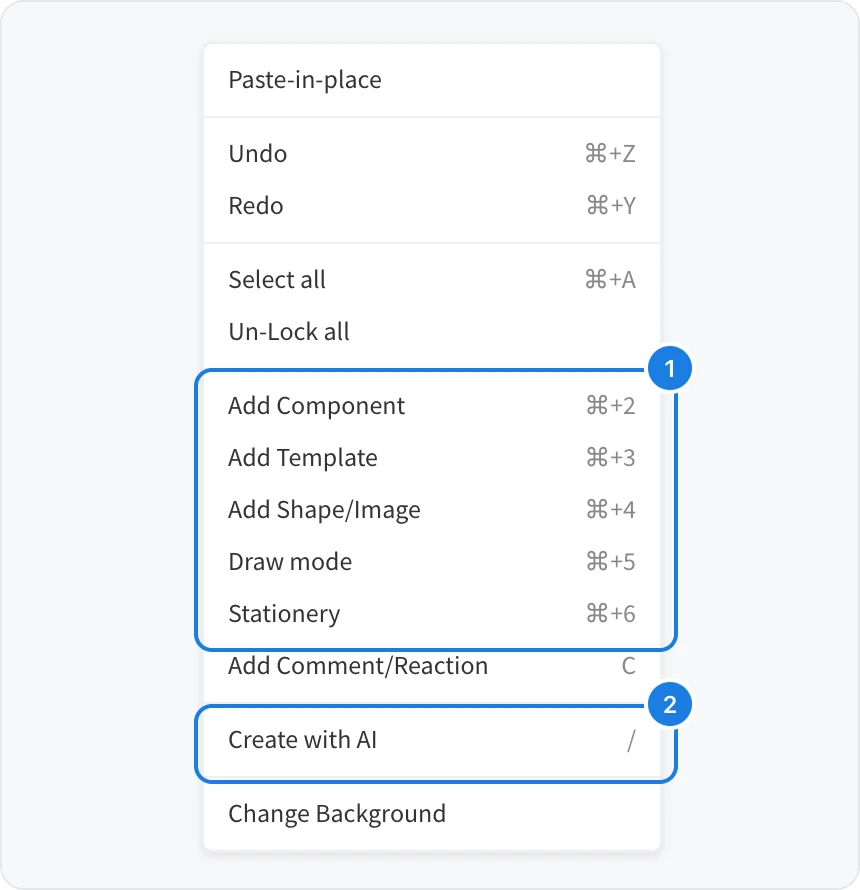
Add Component, Add Template, Add Shape/Image, Draw mode, Stationery and Add Comment/Reaction, with their shortcuts.
Create with AI (or press /) to describe what you want at that spot and let Mida make it.
The same menu also has Paste-in-place, Undo, Redo, Select all and Change Background.
Arrange and edit what you added
Move: drag a component. Select several by dragging a box around them, or press Ctrl+A to select all.
Resize: drag the handles on the edges of a selected component.
Group: select items and press Ctrl+G to move them together. Press Ctrl+Shift+G to ungroup.
Delete: press Delete, or use Delete in the main menu.
Select a component to see its quick settings, and right-click it for more options.
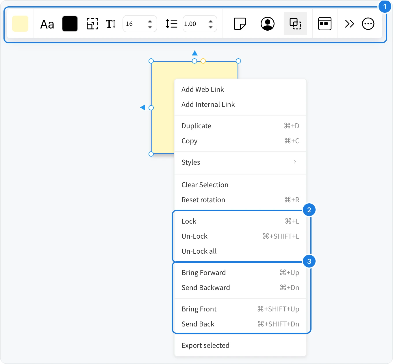
Quick settings: the bar above a selected component changes its look, such as its color, font and text size. The options depend on the component.
Lock (Ctrl+L) keeps a component from being moved by accident. Un-Lock (Ctrl+Shift+L) frees it again.
Layer order: Bring Forward, Send Backward, Bring Front and Send Back decide what sits on top when components overlap.
The menu also has Add Web Link and Add Internal Link, Duplicate (Ctrl+D), Copy (Ctrl+C), Styles to copy one component's look to another, and Export selected. The options depend on the component.
To interact with components without moving them, such as voting in a poll or playing a prototype, switch to Play mode in the tool bar (Ctrl+P). Press Ctrl+E to go back to Edit mode.