
Add a chart and edit its data
Show numbers as bar, line, area, pie, radar, bubble or scatter charts on your MockFlow board: generate a chart with AI, edit or paste its data and change its colors.
Charts turn numbers into a picture that everyone on the board can read at a glance: sales by day, survey answers, a budget split or progress over a term. MockFlow charts sit on the board next to the plans and notes they explain, and you can make one from a sentence or from data you already have.
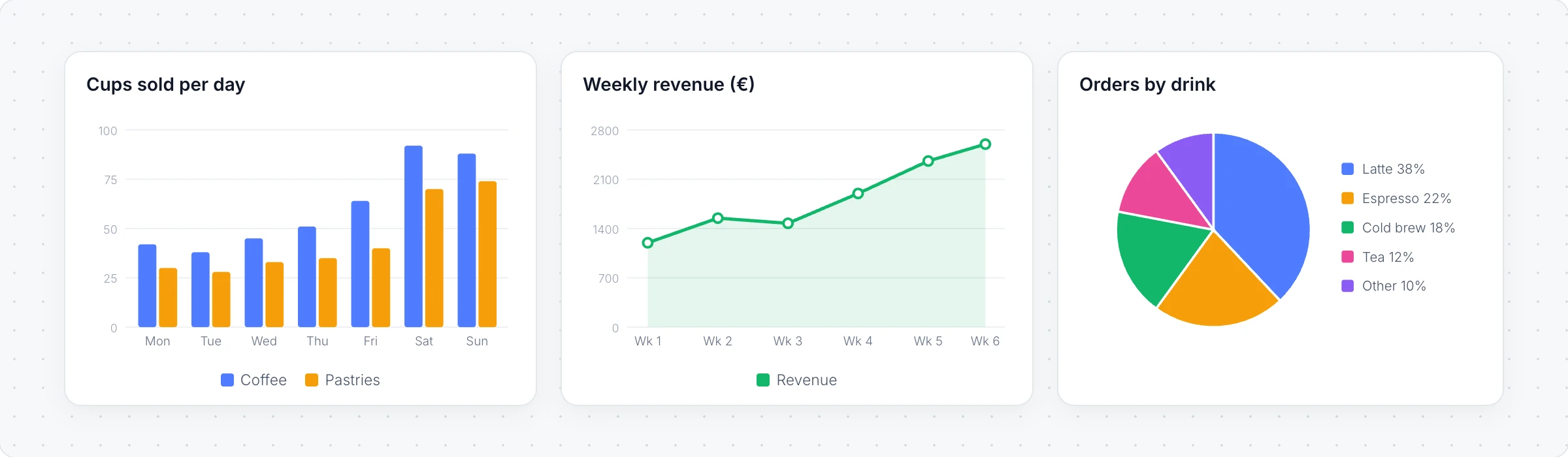
Chart types
Choose the chart that suits the question:
Chart | Good for |
|---|---|
Vertical BarChart and Horizontal BarChart | Comparing amounts, such as sales by day or votes by option |
Horizontal LineChart and Area Chart | Change over time, such as weekly revenue or sign-ups |
Pie Chart | Parts of a whole, such as orders by drink or a budget split |
Radar Chart | Scoring several options on the same criteria |
Bubble Chart and ScatterChart | How two or three values relate, such as price against rating |
Generate a chart with AI
Click Add anything (the plus button) in the toolbar at the bottom of the board and choose a chart, such as Vertical BarChart.
With the chart selected, click Generate with AI in its toolbar and choose Generate new.
Describe what to show, for example "Cups of coffee and pastries sold each day in the first week", and click Generate.
Modify with AI changes the data or labels with a prompt, and Convert to turns the chart into another kind of item, such as a table or a different chart.
Edit a chart's data
Click Edit chart data in the chart's toolbar to open the data editor.
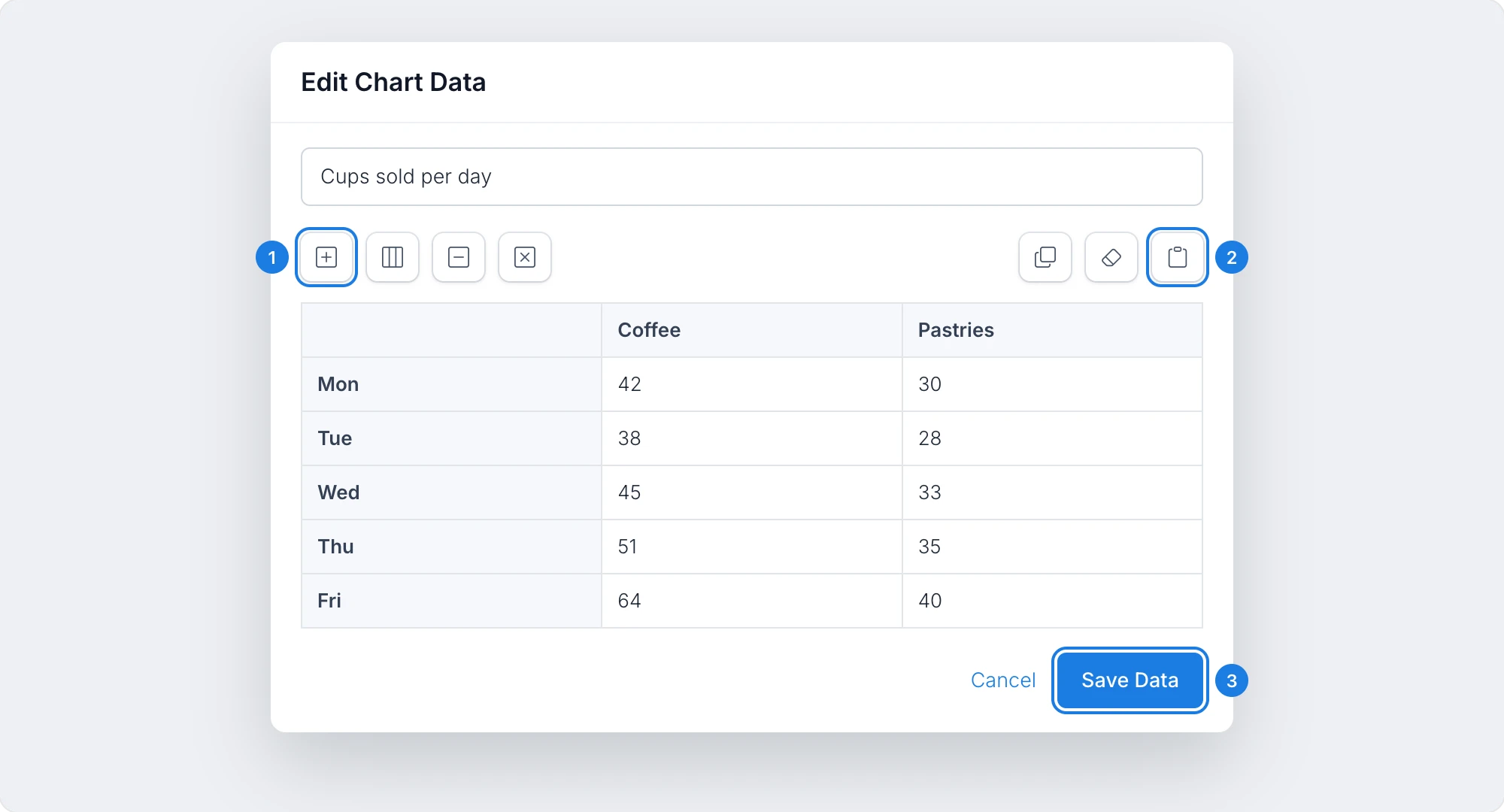
Add Row adds a label, such as another day. Add Column, Delete Row and Delete Column sit beside it.
Paste data takes tab or comma separated data, such as cells copied from a spreadsheet.
Save Data updates the chart.
Type in any cell to change a value, drag rows and columns to reorder them, and add an optional chart title at the top. Copy to clipboard copies the data and Clear all empties the grid.
Change how a chart looks
With the chart selected, the toolbar shows or hides Grid lines, Labels and Legends, and sets the Grid Color and the chart's Colors. Click Interact with Chart to hover over the chart and read its values.
Charts are available on every plan. Generating with AI uses AI credits. See MockFlow pricing.