
Align, space and snap items
Line up items on a MockFlow board with Align and Distribute, follow the alignment guides as you drag, and choose how items snap on each board.
A board is easier to read, present and share when its items line up. MockFlow gives you three tools for this. Align lines up selected items along one edge or their center, Distribute spaces them evenly, and snapping with alignment guides helps you place each item in line as you drag it. Use them for a row of campaign ideas, the screens of a user flow, the cards of a lesson plan or any group of items that belong together.
The animation shows four loose sticky notes being aligned to the same top edge and then spaced evenly with two clicks.

Align and distribute options
Align and Distribute work on two or more selected items. A group counts as one item, so it keeps its own layout and moves as a whole.
Option | What it does |
|---|---|
Align Left | Moves the items so their left edges line up with the leftmost item |
Align Center | Lines up the items on the vertical center line of the selection |
Align Right | Moves the items so their right edges line up with the rightmost item |
Align Top | Moves the items so their top edges line up with the highest item |
Align Middle | Lines up the items on the horizontal center line of the selection |
Align Bottom | Moves the items so their bottom edges line up with the lowest item |
Distribute Horizontally | Gives equal space between items from left to right. Needs at least three items. |
Distribute Vertically | Gives equal space between items from top to bottom. Needs at least three items. |
Align items with the right-click menu
The right-click menu has Align and Distribute for every selection, whatever kind of items it holds.
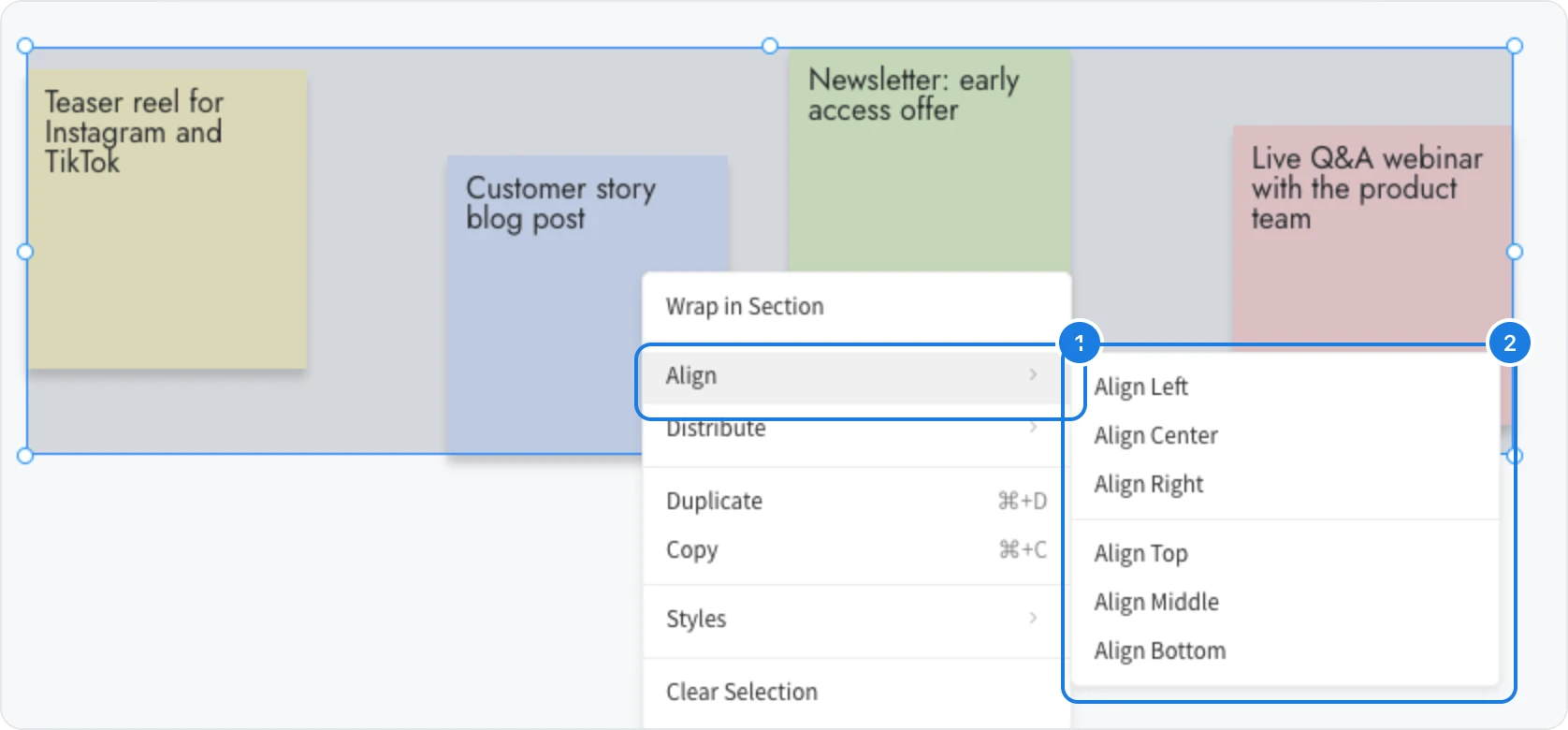
Select the items. Drag a selection box around them on an empty part of the canvas, or hold Shift and click each item.
Right-click one of the selected items.
Point to Align (1). The submenu (2) opens with Align Left, Align Center, Align Right, Align Top, Align Middle and Align Bottom.
Click the option you need. The items move into line and stay selected, so you can apply another option straight away.
To space the items evenly, point to Distribute, just below Align, and choose Distribute Horizontally or Distribute Vertically.
Align items from the toolbar
When the selection holds different kinds of items, for example a heading and a row of sticky notes, the toolbar above the selection includes the align and distribute buttons. When every selected item is the same kind, the toolbar shows the styling options for that kind instead, and Align and Distribute stay in the right-click menu.
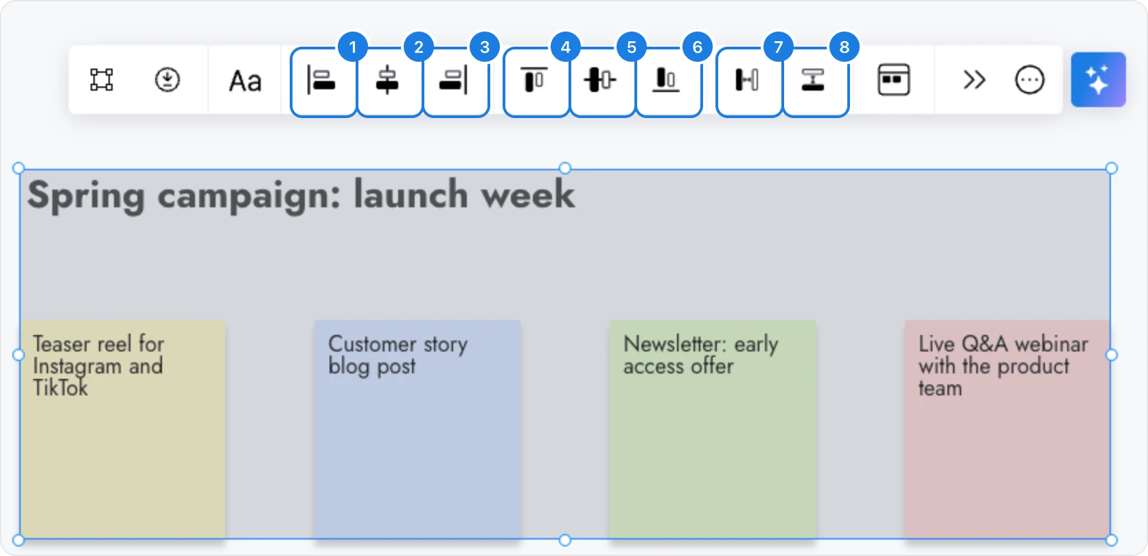
Align left: line up the left edges.
Align center: line up the items on a vertical center line.
Align right: line up the right edges.
Align top: line up the top edges.
Align middle: line up the items on a horizontal center line.
Align bottom: line up the bottom edges.
Distribute horizontal: space the items evenly from left to right.
Distribute vertical: space the items evenly from top to bottom.
Space items evenly with Distribute
Distribute keeps the first and the last item where they are and moves the items between them, so the gaps are all the same. Select at least three items, then choose Distribute Horizontally for a row or Distribute Vertically for a column.
For a neat row, use Align Top or Align Middle first and then Distribute Horizontally. For a neat column, use Align Left or Align Center first and then Distribute Vertically.
Changed your mind? Press Ctrl+Z (⌘Z on Mac) to put the items back where they were.
To move an item by a few pixels after aligning it, see Select, move, resize and rotate items.
Line up items as you drag with alignment guides
While you move or resize an item, dashed alignment guides appear when its edges or its center line up with another item in view. With Snap to Components, the setting every new board starts with, the item also pulls into line when it comes within a few pixels, so you can drop it exactly in place without measuring.

Guides compare the item with the items around it, not with the board's edges. Connectors, lines and drawings do not show guides.
Choose how items snap on a board
Each board has one snap setting. It is saved with the board and applies to everyone who edits it.
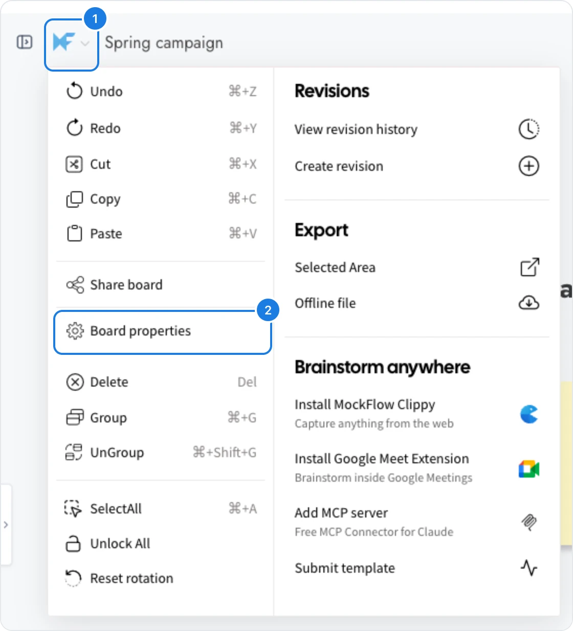
Click the MockFlow logo (1) at the top left of the board to open the board menu.
Click Board properties (2).
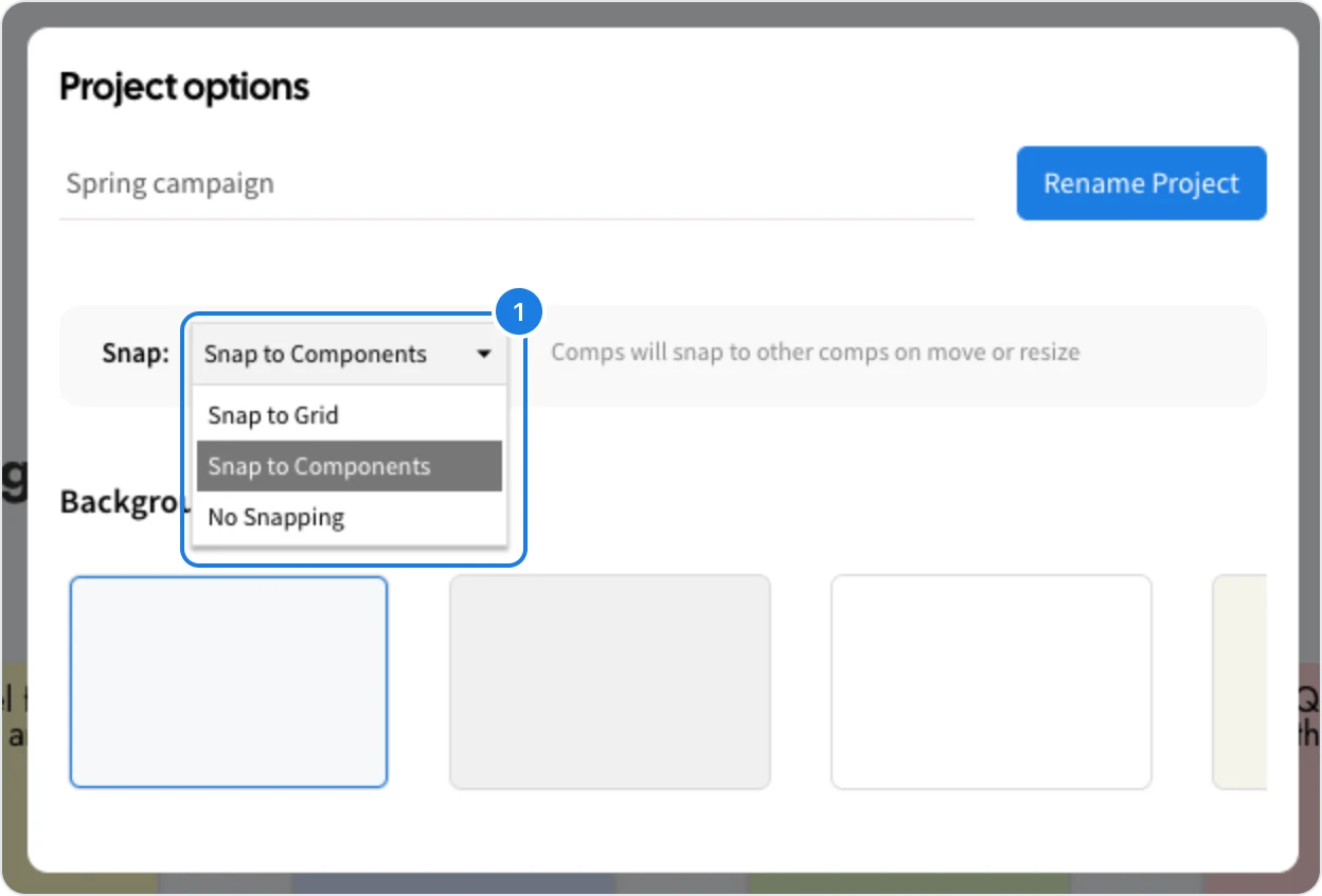
In the window that opens, open the Snap list and choose a setting. It takes effect straight away.
Setting | How items behave | Alignment guides |
|---|---|---|
Snap to Components | Items pull into line with other items when they come close, as you move or resize them | Shown |
Snap to Grid | Items move in fixed steps on an invisible grid, which keeps spacing consistent | Not shown |
No Snapping | Items move freely, pixel by pixel | Shown only when items line up exactly |
Set the grid size
When you choose Snap to Grid (1), a number field (2) appears beside the list. It sets the size of the grid steps, from 5 to 100 pixels. The default is 5. A larger step, such as 20, makes it easy to keep cards and frames the same distance apart across a whole board.

Snap to Components suits most boards, because items line up with each other as you work. Choose Snap to Grid for layouts that need fixed spacing, such as a grid of cards or a page of wireframe screens, and No Snapping for free placement, such as a moodboard or a sketch.