
How to use Toggle Component visibility?
If you want to create a toggle effect when a user clicks on a menu item, a list of options appears. Clicking the same menu item...
If you want to create a toggle effect when a user clicks on a menu item, a list of options appears. Clicking the same menu item again hides the list, allowing users to easily expand or collapse options. Follow the steps below to use the Toggle Component Visibility interaction.
To use Toggle Component Visibility, select a component and click 'Manage Interactions.'
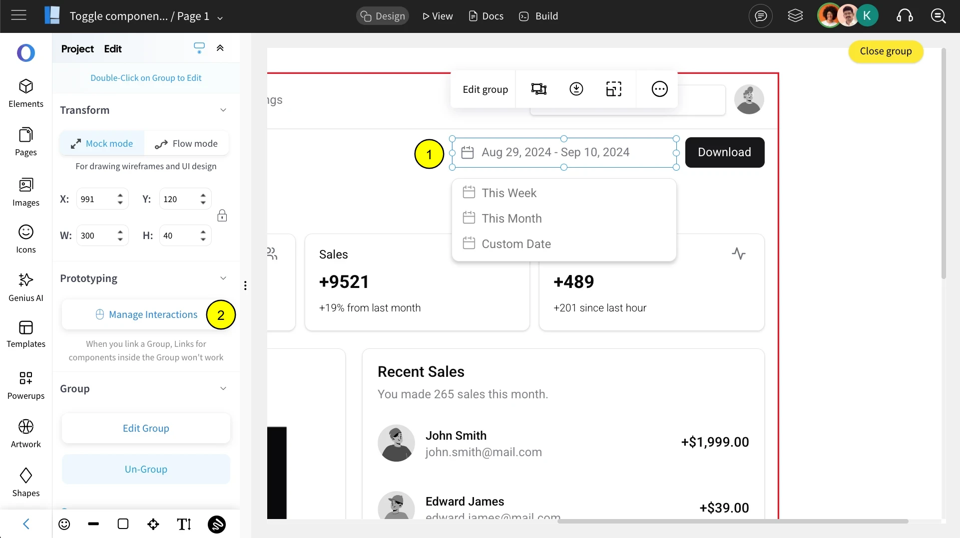
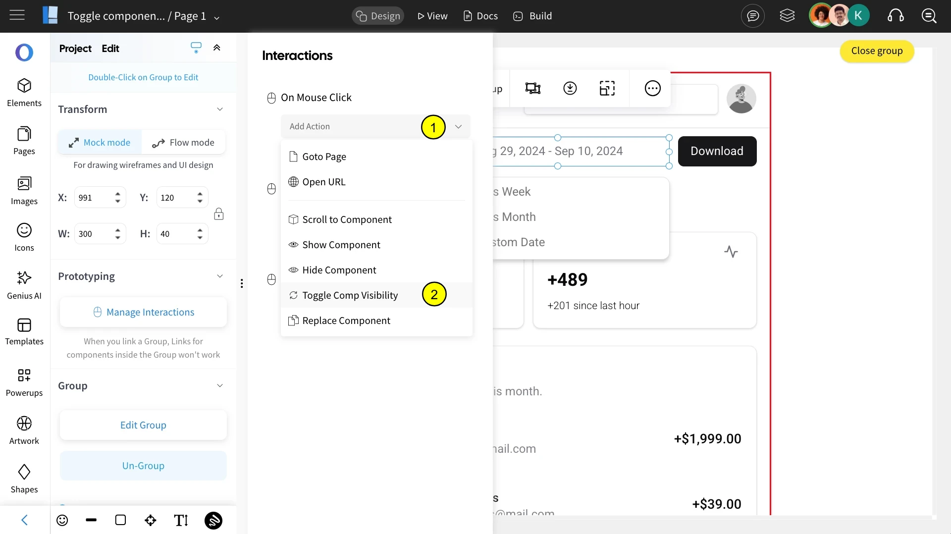
Choose the preferred interaction from the list and select 'Toggle Component Visibility.'
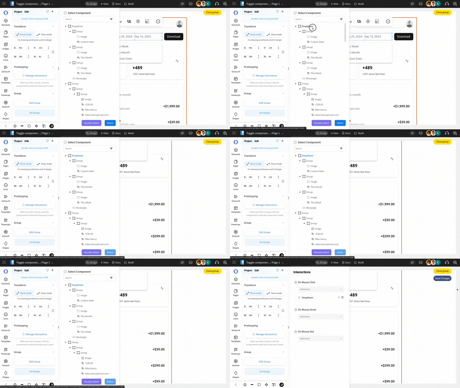
Specify the component affected by the action by either visually selecting it or choosing it from the displayed components list. Once selected, click 'Select.'
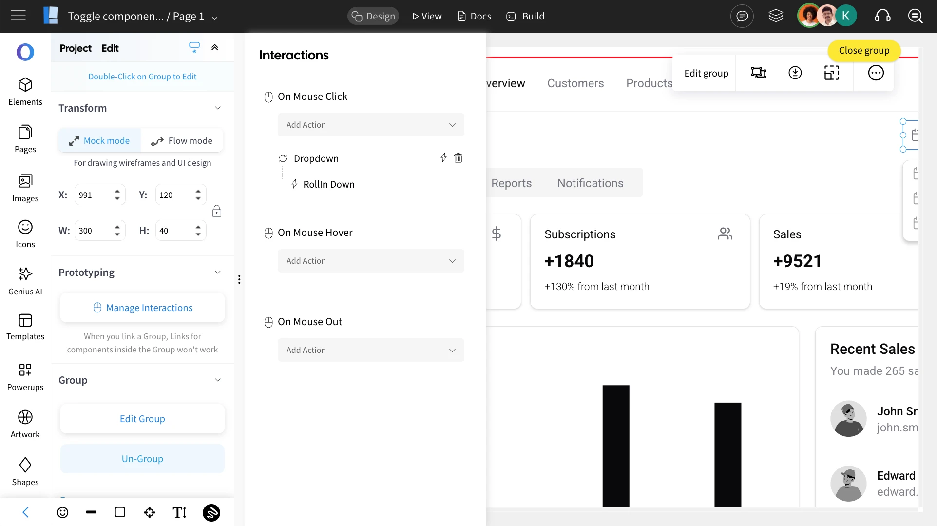
Now, add the effect to the selected action. Refer to this article for instructions on adding effects and editing transitions.
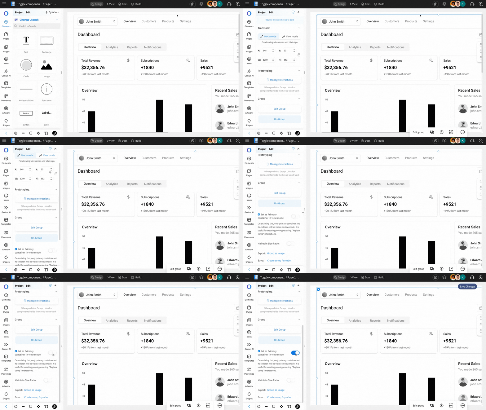
Now we are going enable the primary container by clicking on the grouped component and toggling on the 'Set as primary container.'
Note - On enabling this, only primary container and its children will be visible in view mode.
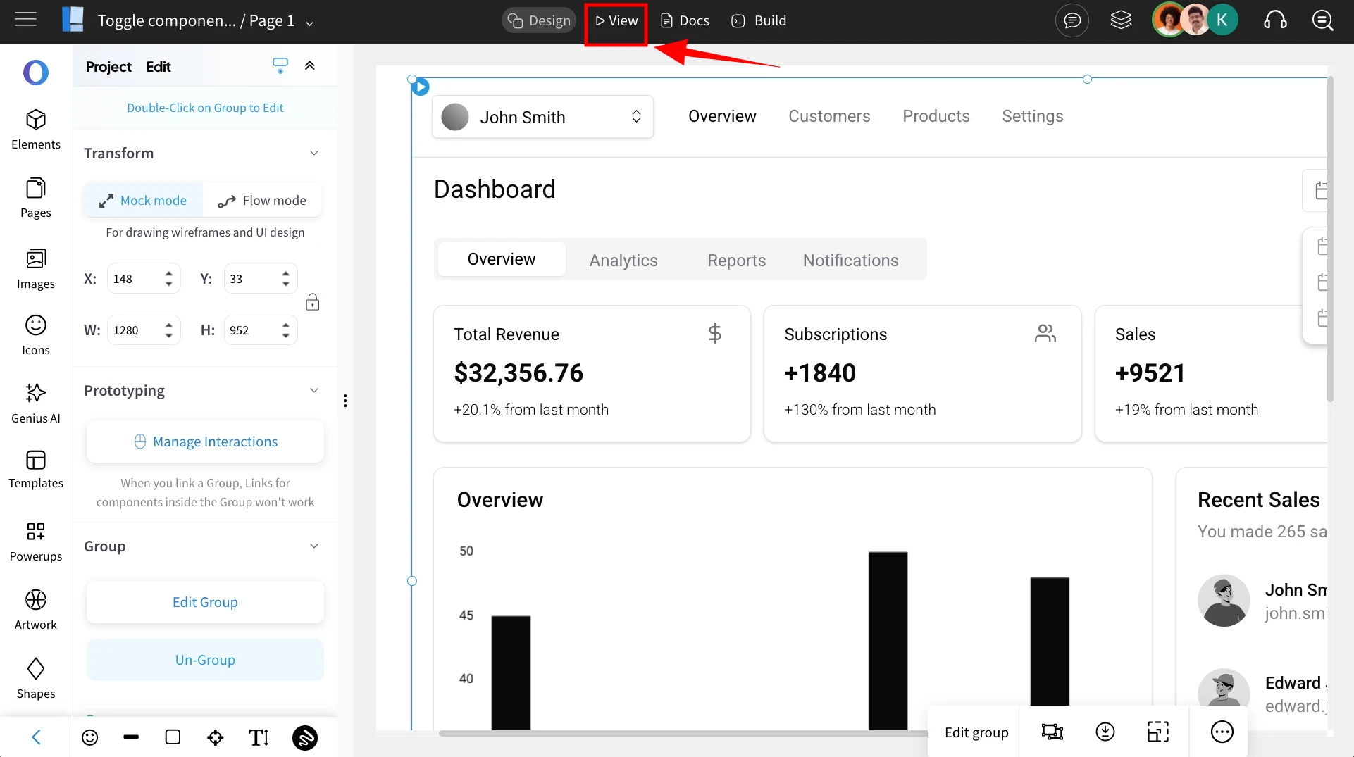
Once everything is set up, switch to View Mode by clicking on 'View' to see the interaction in action.
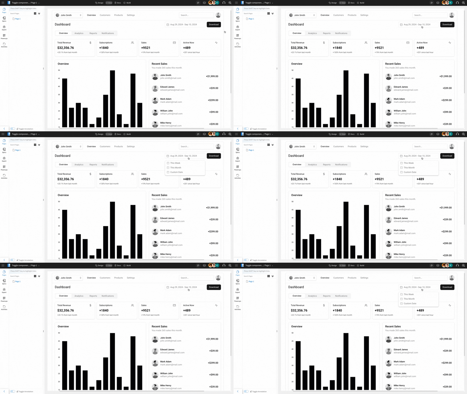
Clicking the component will reveal the dropdown list, and clicking it again will hide it, allowing easy expansion or collapse.
Refer to this video below to get a detailed view on Toggle Component Visibility action: