



 Color Contrast Checker
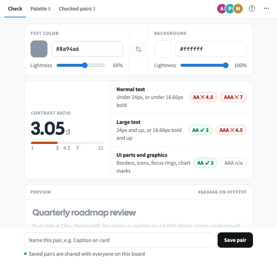
 tests a text color against a background and shows the contrast ratio with the WCAG 2.2 result for normal text, large text and UI parts. Type a hex code, an rgb() or hsl() value or a color name, or use the color picker and lightness slider.
Use Color Contrast Checker together on your board.
When a pair fails, it suggests the nearest text or background color that passes AA or AAA. Each suggestion keeps your hue and changes only lightness, and one click applies it.
It runs on a shared MockFlow board, next to your designs. The board palette and the list of checked pairs are shared with everyone on the board, and each saved pair shows who saved it and when.
- WCAG 2.2 AA and AAA checks. Results for normal text, large text, and UI parts and graphics, with the ratio never rounded up, so 4.49:1 fails AA as it should.
- Nearest passing colors. Text and background suggestions for AA and AAA that keep your hue and saturation and change only lightness.
- Live preview. A heading, body text, a 13px caption, a button, a field and an icon drawn in the pair you are checking.
- Any color format. Hex, rgb(), hsl() and color names, plus transparent colors, which are blended over the background before the ratio is worked out.
- Shared palette grid. Add colors once and see every text and background pair rated in one grid that everyone on the board shares.
- Checked pairs with who saved them. A shared list of named pairs with their ratio and rating, showing who saved each one and when.
How to use Color Contrast Checker.
Enter two colors
Type a text color and a background, for example #777777 on #ffffff, or pick them with the swatches. The ratio and the AA and AAA results update as you type.
Read the results
Normal text needs 4.5:1 for AA and 7:1 for AAA. Large text needs 3:1 for AA and 4.5:1 for AAA. UI parts and graphics such as borders and icons need 3:1.
Fix a failing pair
Under Nearest passing colors, choose the text or background suggestion for AA or AAA. It keeps the hue and moves only lightness until the pair passes.
Save the pair
Give the pair a name such as Caption on card and choose Save pair. It appears under Checked pairs for everyone on the board.
Build the board palette
Open Palette and add your brand and UI colors. A grid rates every text and background combination as AAA, AA, AA18 or Fail.
Open any combination
Choose a cell in the palette grid, or Open on a checked pair, to load it into the checker and adjust it.
Who uses Color Contrast Checker.
A designer reviewing a new screen
Check each text color against its background and save the passing pairs under names the team recognises.
A design system team defining colors
Add the brand palette and use the grid to agree which combinations are allowed for body text, large text and icons.
A developer fixing an accessibility audit
Paste the failing colors, apply the nearest passing suggestion and share the fixed pair with the designers on the board.
A product team in a design review
Keep the checked pairs next to the mockups so everyone can see which choices were tested and who checked them.
Add Color Contrast Checker to your board.
Use on a board opens a new board with Color Contrast Checker already on it. To add it to a board you already have, follow these steps. Each copy keeps its own data, so a vote on one board never changes another.
Open your board
Open the MockFlow board you want to use it on.
Add it from the Artifact Library
Click Add anything (the plus button) in the toolbar at the bottom of the board, switch to Artifacts and pick Color Contrast Checker under Utilities. Adding it does not use AI credits.
Use it together
Click Interact with Component (the hand button), or switch the board to Play mode. Everyone on the board uses the same app, and Reset shared data clears it for the next session.







 Brainstorm with MockFlow MCP


