
Introducing Component level themes in MockFlow
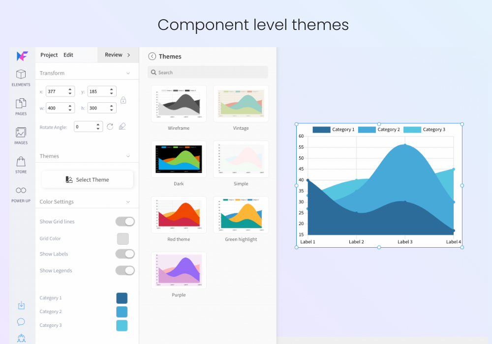
We all know MockFlow offers a huge library of UI packs for almost every UI framework, industry and use case out there. Today's release goes one step further as we introduce component level themes.
What are component level themes?
Themes that are component specific and apply styles only to the selected component. With component level themes, you can easily change its appearance by applying a theme from its list as shown above. Current support includes button, text, shapes, charts and grids.
Benefits of component level themes
Easy switching of component styles
Includes popular themes like outline, dark, light, gradient
Has advanced options like background patterns and complex shadows
Avoids opening of UI packs for common themes like primary, disabled buttons
In the coming weeks, themes will be supported in more components and also will see in increase in theme options.