How to Build a PERT Chart: 4 Examples, Templates, and Calculations
A PERT chart is a project network diagram that shows how activities connect, how long they may take, where key milestones sit, and which sequence forms the critical path. PERT stands for Program Evaluation and Review Technique and is especially useful when project timing is uncertain.
It helps teams see which tasks depend on others, which can run in parallel, and which sequence controls the minimum completion time. To account for uncertainty, PERT uses Optimistic, Most Likely, and Pessimistic time estimates.
In this guide, we’ll show how to calculate, create, and understand PERT charts through practical PERT chart examples based on real project scenarios.
How to make a PERT chart in 5 steps with IdeaBoard
A PERT chart is created by mapping project activities according to their dependencies and expected durations. The completed network then reveals the critical path, which determines the shortest possible project completion time.
When teams need a quicker starting point for mapping activities and dependencies, a PERT chart template can provide a ready-made structure for organizing durations, parallel paths, and the critical path in one place.
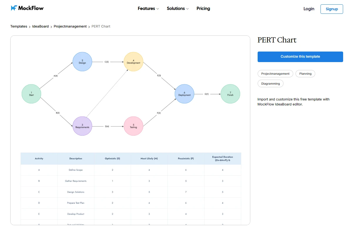
Customize this PERT Chart template
Step 1: List project activities and milestones
Start by breaking the project into specific activities whose dependencies can be clearly identified. In PERT, an activity is work that takes time to complete, while a milestone marks a significant checkpoint or completion event.
These same building blocks also appear in a project management flowchart, where tasks, milestones, and dependencies make the project sequence easier to follow.
For a small product release, the activity list below gives us a simple base we can reuse across the PERT chart examples that follow:
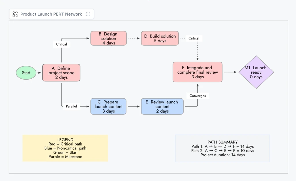
Product launch PERT chart created with IdeaBoard
Activity ID | Task | Predecessor | Duration |
A | Define project scope | None | 2 days |
B | Design solution | A | 4 days |
C | Prepare launch content | A | 3 days |
D | Build solution | B | 5 days |
E | Review launch content | C | 2 days |
F | Integrate and complete final review | D, E | 3 days |
M1 | Launch ready milestone | F | 0 days |
If an activity is still too broad to estimate with confidence, break it into smaller activities before building the network. Smaller units make dependencies clearer and give the optimistic, most likely, and pessimistic estimates a more concrete basis.
Step 2: Identify task dependencies and sequence
Next, map how the activities connect. Identify what must happen first, which tasks can run in parallel, and where separate paths converge.
PERT follows the same activity-and-dependency logic used in arrow diagramming. A predecessor comes before another activity, while a successor follows it.
In our example, A leads to B and C, D depends on B, E depends on C, and both paths meet at F. Getting these relationships right is essential for calculating the correct critical path.
Step 3: Estimate activity duration using the PERT formula
When an activity’s duration is uncertain, PERT uses three estimates: optimistic (O) for the best-case duration, most likely (M) for the expected duration, and pessimistic (P) for the worst-case duration.
Calculate the expected time with:
Expected Time = (O + 4M + P) ÷ 6
For activity D, "Build solution", in our example:
O = 3 days
M = 5 days
P = 7 days
PERT estimate = (3 + 4 × 5 + 7) ÷ 6 = 5 days
Keep the PERT estimate separate from the date stakeholders want the activity completed. Treat duration and deadline separately so an aggressive target date does not silently become the activity estimate and distort the network.
Step 4: Build the PERT network diagram in IdeaBoard
Now turn the task sequence into a visual network. Similar to a workflow diagram, the layout should make the sequence and branching of work easy to follow. In our example, A splits into two parallel paths:
- A → B → D
- A → C → E
Both paths reconnect at F before reaching the final milestone.
In MockFlow IdeaBoard, you can map this flow on a visual canvas using diagramming components and connectors. For a faster first draft, the AI Toolbox can generate a structured diagram from a prompt, which you can then refine around the correct PERT dependencies and durations.
Keep the layout easy to scan. The diagram should clearly show where work starts, where paths split, and where dependencies converge.
Step 5: Calculate and highlight the critical path
The critical path is the longest-duration route from the project start to the final milestone. It determines the project’s minimum completion time, so delays on this path can delay the whole project.
For our example:
Path 1: A → B → D → F = 14 days
Path 2: A → C → E → F = 10 days
So, A → B → D → F is the critical path.
The shorter path has four days of scheduling flexibility before it affects the project finish date. Highlight critical activities and connectors in a contrasting color so they are easy to spot when reviewing different PERT chart examples.
Top 4 PERT chart examples and templates
PERT chart examples show how project activities are connected, how long each activity is expected to take, and which sequence forms the critical path. Looking at different project scenarios makes it easier to understand how a PERT network works and how the same planning method can be applied across different types of projects.
1. Simple project PERT chart
Suppose a team is preparing a small product release. The work begins with defining the scope, then splits into product and content work before both paths come together for the final review.
Activity | Task | Predecessor | O | M | P | Expected Time |
A | Define scope | None | 1 | 2 | 3 | 2 days |
B | Design solution | A | 2 | 3 | 4 | 3 days |
C | Prepare launch content | A | 1 | 2 | 3 | 2 days |
D | Build solution | B | 3 | 5 | 7 | 5 days |
E | Review launch content | C | 1 | 2 | 3 | 2 days |
F | Final integration and review | D, E | 2 | 3 | 4 | 3 days |
The network splits after A because B and C can happen in parallel. Both branches reconnect at F.
- Path 1: A → B → D → F = 13 days
- Path 2: A → C → E → F = 9 days
So, A → B → D → F is the critical path.
When teams need to map these activities and dependencies visually before calculating the critical path, MockFlow’s arrow diagram template provides a structured way to arrange activities, parallel paths, and connectors in one network.
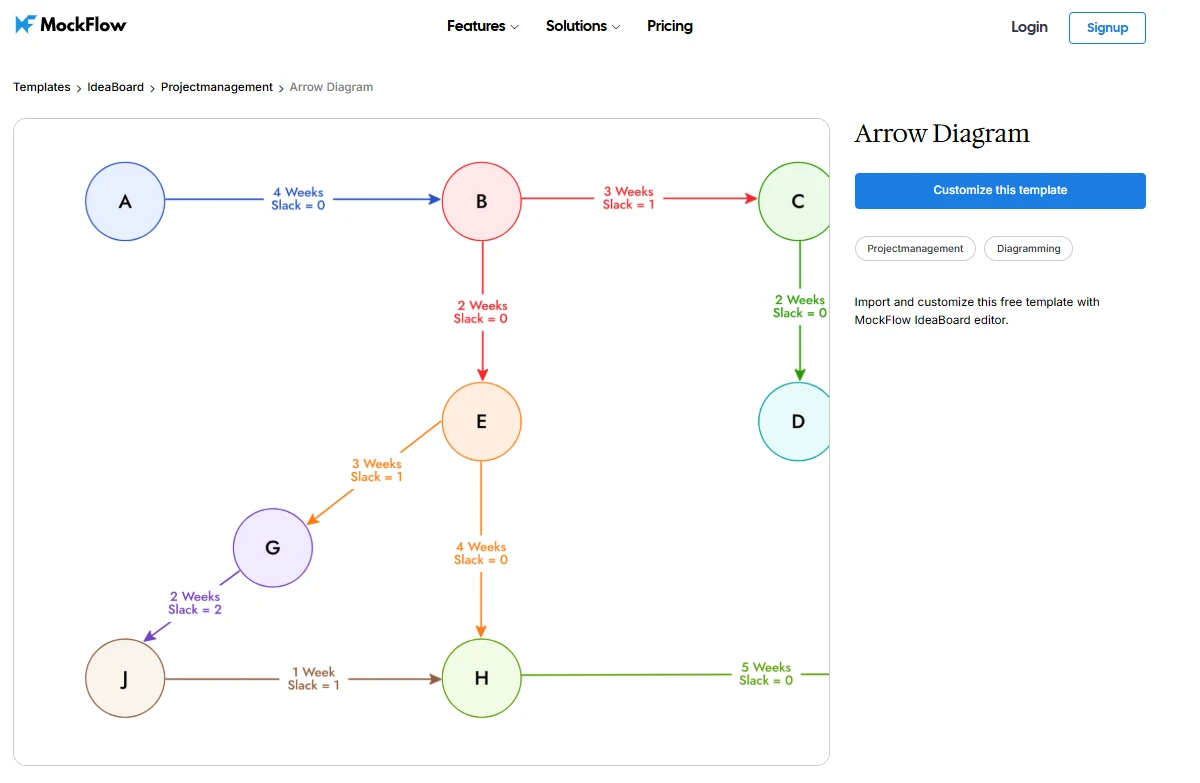
Customize this arrow diagram template in IdeaBoard
2. Software development PERT chart
Software projects make useful PERT chart examples because development often splits into parallel workstreams. Here, frontend and backend work separately before later stages depend on both being complete.
Activity | Task | Predecessor | O | M | P | Expected Time |
A | Requirements | None | 2 | 3 | 4 | 3 days |
B | System design | A | 3 | 4 | 5 | 4 days |
C | Frontend development | B | 4 | 6 | 8 | 6 days |
D | Backend development | B | 5 | 7 | 9 | 7 days |
E | Integration | C, D | 2 | 3 | 4 | 3 days |
F | Testing and debugging | E | 2 | 5 | 8 | 5 days |
G | Deployment | F | 1 | 2 | 3 | 2 days |
Frontend and backend development start after system design and run in parallel. Both paths converge at integration.
Frontend path: A → B → C → E → F → G = 23 days
Backend path: A → B → D → E → F → G = 24 days
So, the backend sequence forms the critical path. Testing and debugging also carries more uncertainty because its optimistic and pessimistic estimates are further apart.
When teams need a visual starting point for this workflow, a Software Development Lifecycle template can be adapted to show PERT dependencies, parallel development paths, and expected durations.
Customize this software development lifecycle template in IdeaBoard
3. Event planning PERT chart
Consider an event where speaker confirmation and marketing begin after the venue is booked, then converge during final preparations.
Activity | Task | Predecessor | Expected Time |
A | Define event | None | 2 days |
B | Book venue | A | 4 days |
C | Confirm speakers | B | 3 days |
D | Launch marketing | B | 3 days |
E | Open registration | D | 2 days |
F | Final preparations | C, E | 4 days |
G | Event milestone | F | 0 days |
Speaker coordination and marketing run in parallel after B, then reconnect at F.
Speaker path: A → B → C → F = 13 days
Marketing path: A → B → D → E → F = 15 days
So, the marketing and registration branch is the critical path.
When teams need to visualize this workflow before arranging it as a PERT network, the Event Planning Template provides a useful starting structure for the main activities and dependencies.
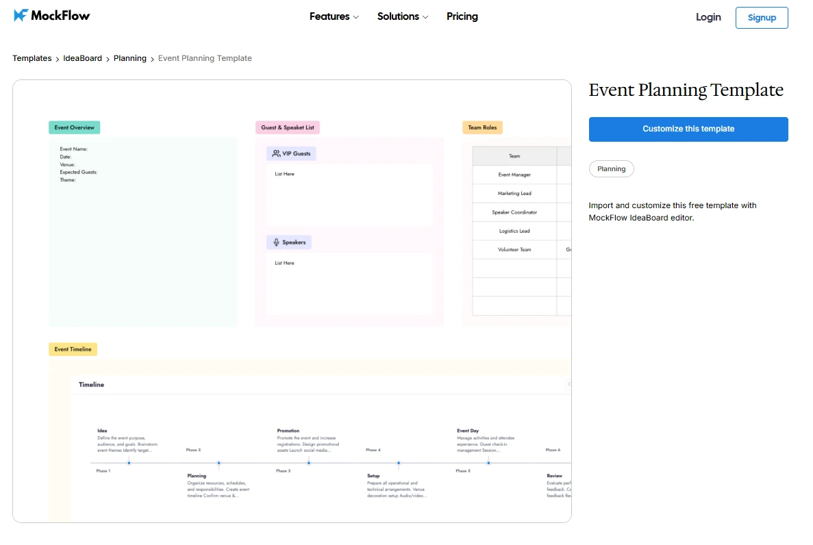
Customize this event planning template in IdeaBoard
4. Product launch PERT chart
A product launch often has two parallel workstreams. Product development moves through QA, while marketing prepares the campaign. Both must be complete before launch approval.
Activity | Task | Predecessor | Expected Time |
A | Define launch scope | None | 2 days |
B | Product development | A | 6 days |
C | QA | B | 4 days |
D | Define messaging | A | 3 days |
E | Create marketing assets | D | 3 days |
F | Set up campaign | E | 2 days |
G | Launch approval | C, F | 1 day |
H | Release milestone | G | 0 days |
After A, the project splits into product and marketing paths before reconnecting at G.
Product path: A → B → C → G = 13 days
Marketing path: A → D → E → F → G = 11 days
The product path is critical. A delay in development or QA can push the launch date, while the marketing path has two days of scheduling flexibility.
When teams need to map both workstreams before arranging them into a PERT network, the Product Launch template provides a useful structure for organizing launch activities and dependencies.
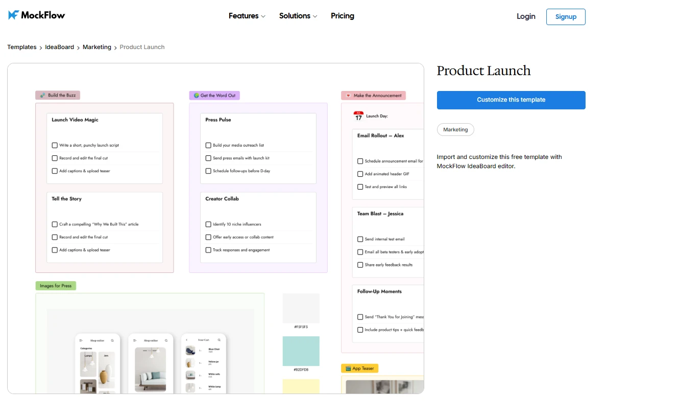
Customize this product launch template in IdeaBoard
When should we use a PERT chart?
Use a PERT chart when a project has several dependent activities and the sequence matters as much as the duration. During team planning, it becomes especially useful when timing is uncertain, parallel workstreams need coordination, and the team needs to see which path could delay completion.
PERT works well when:
- Activities depend on one another
- Task durations are difficult to predict
- Parallel workstreams need to be coordinated
- Schedule risk needs closer analysis
- Identifying the critical path is important
- A simple task list cannot show the project logic clearly
The PERT chart examples above reflect common use cases such as software development, product launches, and event planning. The same method also works well for construction, complex implementations, and research or engineering projects.
For teams already managing execution in Trello, IdeaBoard’s Trello whiteboarding integration can keep visual planning connected to the project tasks that follow.
PERT chart vs Gantt chart: Which should we use?
PERT focuses on task relationships and critical-path analysis. Gantt charts focus on when work happens and how progress is tracked over time.
Factor | PERT Chart | Gantt Chart |
Main focus | Dependencies | Calendar schedule |
Format | Network diagram | Timeline |
Duration | Handles uncertainty well | Uses scheduled durations |
Parallel work | Shows network branches | Shows overlapping bars |
Critical path | Core use case | Can also display it |
Best use | Planning and network analysis | Scheduling and tracking |
Use PERT to understand how activities affect one another. Use a Gantt chart to communicate dates and progress. Many teams use both, especially when working across visual project management tools that support timelines, milestones, dependencies, and multiple planning views.
Advantages and disadvantages of PERT charts
PERT charts are useful for understanding dependencies, uncertainty, and critical-path risk before execution begins. Their main limitation is that the network becomes harder to maintain as the project grows or changes.
A 2026 Springer analysis of three construction projects found possible durations varied by about ±10%. PERT estimates provide a baseline, but scheduling uncertainty can still produce a wider range of outcomes.
Advantages | Disadvantages |
Makes task dependencies easier to understand | Large networks can become complex |
Helps identify the critical path | Depends on accurate dependency mapping |
Accounts for uncertainty with three-point estimation | Duration estimates are still subjective |
Reveals work that can happen in parallel | Changes may require recalculation |
Highlights scheduling risk | Can be excessive for simple projects |
Supports planning before execution | Does not replace day-to-day project tracking |
Conclusion
A PERT chart turns project planning into a clear sequence:
Activities → Dependencies → PERT estimates → Network diagram → Critical path
It is especially useful when task durations are uncertain and teams need to understand how one activity affects the next. IdeaBoard helps make that planning process easier to visualize by giving teams a flexible canvas for arranging activities, drawing dependency connections, separating parallel paths, and highlighting the critical path clearly.
You can also start from one of the relevant templates referenced in the examples and adapt it to your own project structure instead of building the network from scratch.
Ready to map your next project? Start building in MockFlow and turn a complex schedule into a network your team can follow.
FAQs
1. What is a PERT chart with an example?
A PERT chart is a project network diagram that shows activities, dependencies, estimated durations, and the critical path. Common PERT chart examples include software projects where frontend and backend development run in parallel before reconnecting at integration, testing, and deployment.
2. Is PERT still used today?
Yes, PERT is still useful for projects with uncertain activity durations and complex dependencies. It helps teams analyze project networks, compare possible paths, and identify the critical path when completion time depends on several connected or parallel activities.
3. How do I create a PERT chart?
Create a PERT chart by first listing the project activities and defining their dependencies. Then estimate activity durations, arrange the tasks into a network diagram, calculate each possible project path, and identify the longest path as the critical path.
4. What is the difference between a Gantt chart and PERT?
A PERT chart focuses on network logic, dependencies, and the sequence that controls project completion. A Gantt chart places activities against calendar time, making it more useful for communicating schedules, overlapping work, deadlines, and ongoing project progress.
5. Which is better, CPM or PERT?
Neither CPM nor PERT is universally better. PERT is more useful when activity durations are uncertain because it uses optimistic, most likely, and pessimistic estimates. CPM suits projects with more predictable durations and focuses on identifying the sequence controlling completion.
6. Is a Gantt chart outdated?
No, Gantt charts are still widely useful for scheduling, timeline communication, progress monitoring, and showing overlapping work. PERT and Gantt support different planning needs, so teams can use PERT for dependency analysis and Gantt charts for schedule communication.

Miro vs FigJam Comparison: Features, Pricing & Use Cases Explained
Introduction If you’ve been exploring digital whiteboarding tools, Miro and FigJam are likely two names you’ve come across...

Wireframing Process: A 5-Stage Practical Workflow for Product Teams
A wireframe can either save a project weeks of rework or create the confusion that causes it. The outcome usually comes down to...

Affinity Diagram: A Practical Guide to Organizing Ideas and Insights
Introduction Brainstorming sessions often produce dozens of ideas in minutes, but it gets difficult to figure out which ideas...
