How an API Diagram Works and How to Create One Step by Step
API-based systems can be complex, but explaining them does not have to be. A clear visual can help teams understand how applications, services, databases, and third-party tools connect.
An API diagram makes those relationships easier to see. It shows how requests move through a system. It can also highlight where authentication happens, how data is processed, and how responses return to the client. This shared view helps developers, product teams, and stakeholders stay aligned.
In this guide, we will learn what an API diagram is and why it matters. We will also explore the main diagram types, key components, and how to make one with use cases.
What is an API diagram?
An API diagram is a visual representation of how applications, services, databases, and external systems communicate through APIs. It shows the main components, the direction of communication, and how requests, responses, and data move through the system.
A typical application programming interface diagram may include clients, endpoints, API gateways, authentication services, backend services, and databases. A simple flow might look like this:
Client → API gateway → Backend service → Database → Response
API diagrams can show either the broader API architecture or a detailed sequence of interactions. They complement OpenAPI or Swagger documentation by showing how each API fits into the wider system.
Why use API diagrams?
API diagrams give teams a shared view of how a system works. They make complex connections easier to understand and reduce the need to explain the architecture across several documents.
Akamai’s 2025 API Security Impact Study found that while more than 70% of surveyed organizations reported having a complete API inventory, only 37% knew which APIs returned sensitive data. API diagrams can make these gaps easier to identify by showing how endpoints, services, data stores, and security boundaries connect.
This added visibility supports teams in several practical ways:
- Improve design reviews: Teams can review the API architecture before development begins.
- Reveal dependencies: Services, databases, and third-party connections become easier to identify.
- Support onboarding and troubleshooting: New developers can understand the system faster, while existing teams can trace request paths and locate issues.
- Strengthen collaboration: Engineering, product, QA, and security teams can work from the same visual reference.
In IdeaBoard, teams can virtually collaborate on API designs, add comments, group related services, and update diagrams as the architecture changes. This helps keep the diagram accurate, current, and aligned across teams.
What are the main components of an API diagram?
An API diagram does not need to show every technical detail. It should focus on the components that explain how a request enters the system, where it is processed, and how data moves.
The table below covers the six core components most teams include:
Component | What it represents | What to label |
Clients | The systems that send requests, such as web apps, mobile apps, partner platforms, or internal tools. | Client name and role |
API layer | The endpoints and, when used, the API gateway that routes and manages requests. | Relevant endpoints, HTTP methods, and gateway functions |
Security | The authentication and authorization steps that control access. | API keys, OAuth, JWT, roles, or identity providers |
Backend services | The applications, microservices, or functions that process requests and run business logic. | Clear role-based names, such as “Order service” |
Data stores | The databases, caches, search indexes, or storage systems used by backend services. | Store name and read or write direction |
External systems | Third-party tools and partner APIs connected to the system. | System name and purpose of the connection |
Arrows can show the direction of requests and responses. Labels such as GET, POST, JSON, webhooks, or sequence numbers can be added where they make the flow easier to follow. System boundaries may also help separate internal services, external platforms, cloud environments, or security zones.
What are the common types of API diagrams?
The right API diagram depends on what the team needs to explain. Some diagrams show the overall system. Others focus on request flow, endpoint behaviour, interaction order, or external integrations.
The five common types below cover most API design and documentation needs.
1. API architecture diagram
An API architecture diagram shows the main applications, gateways, services, databases, and external systems in one view. It helps teams understand how the system is structured and where key dependencies sit.
Unlike flow or sequence diagrams, it focuses on the overall system rather than the order of individual interactions. This API architecture template shows how these layers work together.
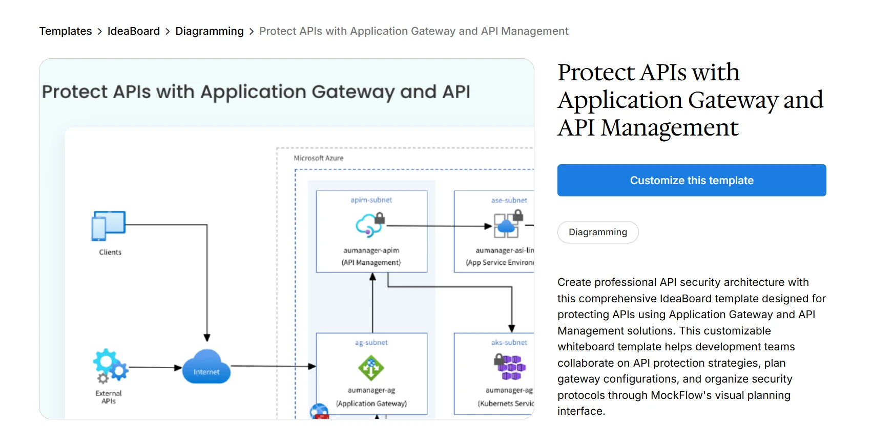
Customize this API architecture template for your next project plan
2. API flow diagram
An API flow diagram shows how a request, response, or piece of data moves through a process. It helps explain what happens from the first action to the final result, including validation and error paths. Like a flowchart, it uses connected steps and decision points to make the process easier to follow.
It focuses on the direction of the process rather than the exact timing of each interaction.
3. REST API diagram
A REST API diagram shows how clients use endpoints and HTTP methods to interact with backend services and data stores. It helps teams understand how resources are created, retrieved, updated, or deleted.
It differs from a broader architecture diagram by focusing on endpoint behavior and the resources behind each request.
4. API sequence diagram
An API sequence diagram shows the order in which clients, services, databases, and external systems exchange requests and responses. It makes clear what happens first, next, and last.
What makes this different from a flow diagram is that it focuses on timing and the sequence of interactions between participants.
5. API integration diagram
An API integration diagram shows how internal systems connect with external platforms, partner tools, and third-party APIs. It helps teams understand what data is exchanged and where each connection begins.
It differs from an architecture diagram by focusing more closely on communication between separate systems.
How to create an API diagram with IdeaBoard
Start with the purpose of the diagram. The audience and the decision it needs to support should guide the level of detail. In IdeaBoard, teams can begin with a blank canvas or use this application gateway and API management template.
Once the scope is clear, we can build the diagram in six simple steps.
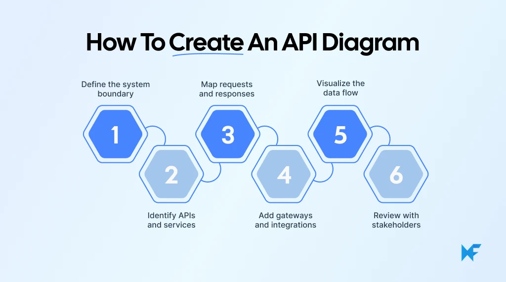
Step 1: Define the system boundary
Decide whether the diagram covers one API, a workflow, a group of microservices, or the full platform. Separate client applications, internal services, data stores, and external systems so the scope is easy to understand.
When the starting information already exists in technical notes, screenshots, documents, or rough prompts, Mida AI can convert that source material into a multi-visual board. The team can then refine the structure instead of recreating every component manually.
Step 2: Add the APIs and supporting components
Place the clients, endpoints, API gateways, authentication services, backend services, databases, queues, and external platforms on the canvas. Use descriptive labels such as “Order API,” “Payment service,” or “Customer database.”
A team mapping a gateway-based architecture can also begin with one of the pre-built templates, then adjust the components to reflect its own environment.
Step 3: Map requests and responses
Connect the components with directional arrows. Label important paths with HTTP methods, endpoint names, protocols, events, or response formats.
For repeated documentation tasks, teams can place an AI Prompt Box with reusable AI recipes directly on the board. This can help contributors follow the same instructions when generating related flows, reducing inconsistencies across diagrams.
Step 4: Show security and failure paths
Add authentication checks, authorization rules, rate limits, retries, callbacks, queues, and error responses where they affect the request flow. Visual boundaries can distinguish public endpoints from protected services or separate internal systems from third-party platforms.
Keep the primary flow easy to trace. Secondary paths should explain important exceptions without overwhelming the main diagram.
Step 5: Review the diagram with stakeholders
Ask developers, architects, QA, DevOps, product, and security teams to validate the systems, dependencies, API names, and request paths.
In distributed setups, teams collaborating through different tools and workspaces such as Microsoft Teams can use the IdeaBoard integration to discuss and edit the visual without moving the review into a separate workspace.
When written comments are not enough, reviewers can attach voice notes or video comments to specific services or connections. This helps preserve the reasoning behind a proposed change.
Step 6: Keep the diagram useful after the review
Add an owner, version, and review date. Update the diagram when endpoints, integrations, or security controls change.
Developers working with compatible AI tools can use IdeaBoard MCP to bring visual architecture work closer to their existing technical workflow. This makes the API diagram more useful as living system documentation rather than a file that becomes outdated after the initial review.
API diagram examples for common system scenarios
API diagrams become easier to understand when we see how they apply to real systems. The examples below show what teams may map in common product and engineering scenarios.
Scenario | What the diagram maps | Example flow | Best diagram type |
Order API design | Request routing, service boundaries, data ownership, and processing order | Customer → Order API → Inventory check → Payment authorization → Order database | API flow or sequence diagram |
Microservices platform | Services, gateways, databases, queues, and external dependencies | Web app → API gateway → User, order, payment, inventory, and shipping services | API architecture diagram |
REST API documentation | Endpoint groups, HTTP methods, authentication, and backend processing | /orders, /customers, and /payments connect to separate services and data stores | REST API diagram |
OAuth login flow | Login, token creation, validation, protected resources, and error responses | Mobile app → Authentication API → Token service → User profile API | API sequence diagram |
Third-party integration | External APIs, exchanged data, webhooks, and failure paths | Ecommerce platform → Payment provider, shipping platform, CRM, and email service | API integration diagram |
Incident investigation | The request path and the point where a delay or failure occurs | Payment webhook → API gateway → Order service → Confirmation update | API flow diagram |
API security review | Public endpoints, authentication layers, trust boundaries, and sensitive data movement | Public client → Application gateway → API management → Protected services | API architecture diagram |
For example, a team reviewing an order API may notice that inventory should be checked before payment is authorized. This can help prevent a customer from being charged when the requested item is unavailable.
Teams that need help shaping the first version can also use the IdeaBoard prompt library to generate a starting structure for common API flows and architecture scenarios.
What are the best practices for making API diagrams?
Atlassian’s 2025 State of Developer Experience survey found that 50% of developers lose at least 10 hours each week to non-coding inefficiencies. Keeping API diagrams current, clearly labeled, and easy to access can reduce the time teams spend reconstructing how a system works.
A good API diagram should answer one clear question. An onboarding diagram may show the full system, while an implementation or debugging diagram may need endpoints, sequence, and error paths.
- Choose the right diagram type: Match the format to the goal, such as architecture, flow, REST, sequence, or integration.
- Keep the scope focused: Show only the services, endpoints, and data stores that support the discussion.
- Use consistent notation: Reuse the same shapes, arrows, colors, and naming patterns throughout the diagram.
- Make the flow easy to follow: Use one clear direction and show how requests and responses move through the system.
- Highlight key boundaries and risks: Mark internal and external systems. Add security steps, retries, timeouts, or fallback paths where they help.
- Review and maintain it: Invite key stakeholders to validate the diagram, update it as the API changes, and share the board for technical documentation, onboarding, design reviews, or project records.
Readable text, clear contrast, and simple labels will make the diagram easier for everyone to use. A date or version can also help teams know they are working from the latest view.
Conclusion
The value of an API diagram comes from the shared understanding it creates. Teams can review decisions faster, spot gaps earlier, and keep architecture discussions grounded in the same visual reference.
MockFlow’s IdeaBoard makes this process easier. Instead of working across scattered documents or static files, teams get a shared visual space to map architecture, review flows, and keep diagrams aligned with technical documentation. With real-time collaboration, flexible editing, and an infinite canvas, it becomes easier to move from system planning to implementation without losing context.
If you want your API planning process to lead to clearer decisions, try building your first API diagram in IdeaBoard. Sign up for a free trial and see how a shared visual model can improve the way your team designs and documents systems.
FAQs
1. What is an API diagram?
An API diagram is a visual model of how applications, services, databases, and external systems communicate through APIs. It shows key components, connections, requests, responses, and data flows so teams can understand the system and document it clearly.
2. What should an API diagram include?
An API diagram should include clients, APIs, relevant endpoints, gateways, backend services, databases, and external systems. It should also show requests, responses, authentication steps, communication direction, and system boundaries when they help explain the architecture or workflow.
3. What is the difference between an API architecture diagram and an API flow diagram?
An API architecture diagram shows the overall structure of a system, including services, gateways, databases, and dependencies. An API flow diagram follows how a specific request or piece of data moves from its starting point to the final response.
4. What is a REST API diagram?
A REST API diagram shows how clients interact with REST resources through HTTP methods and endpoints. Teams can create one in IdeaBoard to map routes, authentication, backend processing, databases, and the responses returned to each client.
5. Which UML diagram is used for APIs?
UML sequence diagrams are commonly used to show API interactions in time order. They map participants, messages, and responses. Component diagrams and deployment diagrams may also support broader views of API architecture, infrastructure, and service relationships.
6. How do we create an API diagram?
Start by defining the scope and identifying the relevant APIs, clients, and services. Then map requests and responses, add infrastructure and integrations, organize the flow visually, and review the completed diagram with technical and product stakeholders.

How to Create a Process Map: A Step-by-Step Guide for Teams
TL;DR: A process map helps teams visualize how work moves from start to finish, including steps, decisions, owners,...

Virtual Team Building Games: 14 Ideas for Remote & Hybrid Teams
Introduction Remote teams are now the norm, not the exception. For all the benefits of flexibility and location freedom, remote...

10 UI/UX Design Trends to Watch For in 2026
Introduction UI/UX design in 2026 is moving in two directions at once. Interfaces are becoming more adaptive, intelligent, and...
