8 SaaS Website Design Trends to Watch in 2026
Introduction
If your SaaS website is due for a refresh, the hardest part is often knowing which design ideas are worth following. Some trends look impressive in a design gallery but do very little to explain the product, build trust, or move visitors toward signup.
That is why SaaS website design trends matter most when they help your website work harder. A modern SaaS site should make the product easier to understand, show value faster, and guide the right buyer toward the next step without adding noise.
In this blog, we will look at the SaaS website design trends shaping 2026 and how you can apply them to your homepage, landing pages, demos, and redesign plans.
What Makes a SaaS Website Feel Modern in 2026?
A modern SaaS website helps visitors understand the product quickly and take the next step with confidence. It explains what the product does, who it is built for, what problem it solves, and why it is worth trusting.
In 2026, this usually means showing the product experience earlier on the page. Strong SaaS websites use real UI design previews, short product-led messaging, clear proof points, and cleaner section layouts that make the page easier to scan.
That clarity matters even more in B2B SaaS, where Forrester reports that an average of 13 people are involved in an organizational buying decision, and 89% of purchases involve two or more departments.
The best sites also reduce friction. They guide different visitors toward the right path, whether that is a signup, free trial, demo request, or self-serve walkthrough. Personalization, interactive demos, trust signals, and focused page structures all support that goal.
Modern SaaS website design is not about copying every visual trend. It is about making the product feel clear, credible, and easy to evaluate from the first scroll.
8 SaaS Website Design Trends to Watch in 2026
The strongest SaaS website design trends in 2026 are less about decoration and more about decision support. Each trend below helps visitors understand the product, evaluate fit, and move forward with less friction.
Trend 1: AI-Driven Personalization
SaaS websites are moving away from one-size-fits-all pages. The newer direction is a more adaptive experience where content changes based on the visitor’s role, industry, use case, or buying intent.
This is popular because different visitors often care about different outcomes. A founder may want speed. An enterprise buyer may look for security. A product manager may want workflow visibility.
To apply this trend:
- Personalize homepage or landing page sections by segment
- Show relevant features based on use case
- Create tailored demo paths for different buyers
- Use CTAs that match visitor intent
Keep personalization helpful and clear. It should guide the visitor, not make the experience feel intrusive.
Trend 2: Interactive Product Demos and Self-Serve Walkthroughs
SaaS buyers want to see how the product works before they commit to a sales call. Gartner found that 61% of B2B buyers prefer an overall rep-free buying experience, suggesting that Chief Sales Officers must adapt as B2B buyers choose digital self-service over sellers.
That is why interactive demos and self-serve walkthroughs are becoming a major part of modern SaaS website design. Static screenshots can still help, but they often fail to explain a workflow. A short interactive demo can show the product in action and give visitors a better sense of fit.
To apply this trend well:
- Add a self-serve demo to the homepage or product page
- Use clickable steps for important workflows
- Let visitors explore by role or use case
- Keep the demo short and outcome-focused
- Use CTAs like “Explore the workflow” or “See how it works”
Trend 3: Product-Led Hero Sections
The hero section is doing more work than ever. Instead of opening with a broad promise and an abstract visual, many websites now show the product above the fold.
This works because visitors can understand the offer before they scroll. It is especially useful when the interface, dashboard, workflow, or output is part of the product’s value.
A strong product-led hero usually includes:
- A clear value proposition
- A readable product UI, dashboard, or workflow visual
- One primary CTA
- One supporting CTA, such as a demo or product tour
- A short proof point near the CTA
Avoid visuals that look polished but say nothing about the product. The hero should make the product easier to understand in seconds.
Trend 4: Trust-First Website Design
SaaS buying decisions carry risk. Visitors want to know whether the product is reliable, secure, and already trusted by teams like theirs. That makes trust-first design a core part of SaaS web design best practices.
The key is to place proof close to decision points. Trust signals work best when they support a CTA, pricing section, product claim, or demo request.
To apply it:
- Place customer logos near key CTAs
- Use testimonials with names, roles, and companies
- Add security, privacy, or compliance proof where relevant
- Make pricing, trial limits, and demo expectations clear
- Use real product screenshots to support claims
- Add review badges or usage metrics only when they are credible
Trust-first design helps visitors feel more confident before they take the next step.
Trend 5: Clarity-Led Minimalism
Minimalism in website design should not make a page feel empty. It should make the product easier to understand. Contentsquare’s 2025 benchmark, based on 90 billion user sessions, found that visits with frustration signals such as rage clicks, slow-loading pages, and excessive hovering increased by 0.6%.
In 2026, the better version is clarity-led minimalism, where every section has a job and every element supports the main message. This works because SaaS visitors scan quickly. A clean layout helps them understand the promise, compare value, and move toward the next step without distractions.
To apply it:
- Keep the homepage focused on one core product promise
- Use whitespace to separate sections
- Remove CTAs that compete with the main path
- Keep copy short and benefit-led
- Avoid crowded feature grids above the fold
The goal is not fewer elements. The goal is fewer distractions.
Trend 6: Motion, Microinteractions, and Scroll-Based Storytelling
Motion still has a place in modern SaaS website design, but it needs a clear purpose. The best use of motion is to explain something that static content cannot show as well.
For example, scroll-based storytelling can walk visitors through a workflow step by step. Hover states can reveal more context on feature cards. Small animations can show before-and-after states, integrations, or product actions.
Use motion when it helps the visitor understand the product faster:
- Animate product steps or workflows
- Use hover states for helpful detail
- Show transitions between product states
- Keep animations lightweight
- Avoid motion near CTAs when it distracts from action
Catchpoint’s 2025 SaaS website benchmark uses recommended targets such as document complete time within 3 seconds, full page load within 5 seconds, and Largest Contentful Paint within 2.5 seconds.
Trend 7: Bold Typography With Strong Content Hierarchy
Bold typography is still a major part of modern SaaS website UI design, but the real value is not size. It is structure. Good typography helps visitors scan the page, understand the message, and separate the main claim from supporting details.
This matters because SaaS pages often carry a lot of information. Strong hierarchy keeps that information from feeling heavy.
To apply it:
- Use a clear H1 for the core product promise
- Keep hero subcopy short and direct
- Use large section headings to guide the page story
- Make CTA labels specific and action-oriented
- Create contrast between claims, proof, and details
Avoid oversized text that hurts readability on mobile. Typography should make the page easier to understand, not harder to use.
Trend 8: Human-Centered Visuals and Custom Product Graphics
SaaS visuals are moving away from generic 3D shapes and overly polished illustrations. In 2026, the stronger direction is more product-specific and human-centered. The visuals should feel useful, distinct, and connected to the product experience.
This could mean workflow diagrams, annotated screenshots, integration maps, or custom graphics that explain how the product works.
To apply it:
- Use product graphics that explain workflows
- Create diagrams for automation, integrations, or data flow
- Use custom illustrations only when they clarify the message
- Add texture, depth, or human touches carefully
- Avoid generic visuals that could belong to any SaaS brand
The best SaaS visuals make the product easier to understand and the brand easier to remember.
How Wireframing Tools Help Apply SaaS Website Design Trends
SaaS website design trends look useful in examples, but they only become practical when translated into page structure. Before moving into final design or development, it helps to test how the homepage, landing page, pricing page, and demo path will actually work together.
That is where MockFlow’s WireframePro fits into a SaaS website redesign workflow. It helps turn modern website design ideas into quick layouts that can be reviewed, changed, and compared before too much time is spent on visual polish.
This makes it easier to:
- Test whether the hero message is clear enough
- Compare different homepage or landing page structures
- Plan where product visuals, demo CTAs, and trust signals should appear
- Build page sections faster using reusable UI components
- Map a self-serve walkthrough before building it
- Review the page flow with marketing, product, design, and development
For teams starting from a rough idea, AI-assisted wireframing can help create editable first drafts from prompts or existing website screenshots. When the page needs interaction, prototyping helps test flows such as demo clicks, guided walkthroughs, and CTA paths before development.
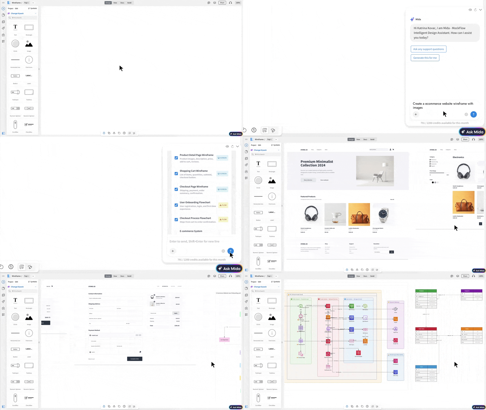
The value is simple: trends become easier to evaluate when they can be seen, tested, and refined as wireframes first. Once the structure is approved, Build Mode can help move the design closer to development by exporting designs into code.
Conclusion
The strongest SaaS website design trends for 2026 are not just visual choices. They help visitors understand the product faster, trust the brand earlier, and move toward signup, trial, or demo with less friction.
AI-driven personalization, interactive demos, product-led hero sections, trust-first layouts, cleaner page structures, and more useful visuals all support the same goal: making the product easier to evaluate.
Before moving into final design or development, MockFlow WireframePro can help turn these website design inspirations into practical wireframes, interactive prototypes, and redesign-ready layouts.
Sign up for MockFlow WireframePro and start shaping your next SaaS website redesign with more clarity.
FAQs
1. What are the top SaaS website design trends in 2026?
The top SaaS website design trends in 2026 include AI-driven personalization, interactive demos, product-led hero sections, trust-first design, clarity-led minimalism, motion, bold typography, custom product graphics, and AI-assisted wireframing. Each trend helps make these websites clearer, more credible, and easier to act on.
2. What makes a SaaS website feel modern?
A modern SaaS website has clear messaging, product-led visuals, strong hierarchy, trust signals, interactive demos, clean layouts, and a simple path to signup or demo. It should help visitors understand what the product does, who it is for, and why it is worth trusting within the first few sections.
3. What should a SaaS homepage include?
A SaaS homepage should include a clear hero message, product visual, primary CTA, proof points, feature sections, use cases, trust signals, and a clear conversion path. The best SaaS homepage design trends focus on showing value early instead of making visitors search for product context.
4. How can SaaS websites use interactive product demos?
SaaS websites can use interactive product demos to show key workflows, guide visitors through product features, and help users understand the product before signup or demo. These demos work best when they are short, role-specific, and focused on one clear outcome.
5. How do wireframing tools help with SaaS website redesign?
Wireframing tools help plan page structure, test messaging hierarchy, compare layout options, prototype interactions, and collect feedback before final design or development. They make website redesign easier because trends can be tested as practical layouts before design and engineering resources are committed.
6. Where can I find SaaS website design inspiration?
Good SaaS website design inspiration usually comes from studying product-led homepages, landing pages, demo pages, pricing pages, and real product walkthroughs. Look for examples that show clear messaging, strong proof, readable product visuals, and a conversion path that matches the buyer’s intent.
How an API Diagram Works and How to Create One Step by Step
API-based systems can be complex, but explaining them does not have to be. A clear visual can help teams understand how...
Lotus Diagram: Step-by-Step Guide with Examples & Benefits
Introduction Brainstorming sessions tend to fall apart when ideas are scattered or too shallow to build on. The lack of a clear...
Storyboard vs Wireframe: When to Use Each in UX Design
TL;DR A storyboard breaks the experience into scenes: who the user is, what triggers the need, what steps they take, where...
