
Best Open Source Icon Libraries in 2026
In the world of design, icons play a crucial role in shaping the visual language of websites, web apps, and mobile applications. As a designer, you know that these small graphical elements play a monumental role in user experience. Yet, finding the right icons – ones that match your style and vision – is often a journey filled with challenges.
Designers, like you, possess a unique flair and inclination towards certain aesthetics. Icons, serving as the visual shorthand of your creations, should seamlessly align with your distinctive design language. But let's face it – the struggle to discover the perfect icons is an all-too-familiar story.
For those seeking open-source icon libraries, this guide outlines the top Open Source Icon Libraries in 2025. Designed for the discerning creator in you, this compilation understands that your design choices are as unique as your fingerprint. It's not just about finding icons; it's about discovering collections that resonate with your style.
And if you're building out your whole toolkit, icons are just the start. It's worth bookmarking a few free design resources for designers too, covering fonts, illustrations, and stock images alongside the icon sets below.
Font Awesome

Font Awesome is a widely used open-source icon library and has been a reliable companion for designers worldwide. Font-Awesome 5 boasts a vast array of icons, ranging from the elemental to the esoteric. Whether you're sculpting a minimalist interface or injecting personality into a bold design, FontAwesome has you covered.
Advanced Styling Options:
What sets Font Awesome 5 apart is its commitment to providing designers with unparalleled control. The library supports a variety of styles, including Solid, Regular, and Light, allowing you to tailor icons to match your project's visual language seamlessly.
FontAwesome 5 has evolved with the design landscape. The latest version introduces new icons, ensuring that designers have access to contemporary symbols that resonate with modern interfaces. Regular updates keep the library in sync with emerging design trends.
Bootstrap Icons

Bootstrap Icons is a dynamic resource with a diverse array of visually captivating options. Tailored for creative projects, these icons seamlessly integrate into websites, applications, and presentations, bringing a touch of sophistication to every visual endeavor. Bootstrap Icons prides itself on its versatility, offering a spectrum of visually appealing options that span across various categories. From conventional UI elements to distinctive symbols, these icons are crafted to cater to the eclectic tastes of designers, developers, and content creators.
Empowering designers, developers, and content creators alike, Bootstrap Icons grants creative freedom. Its extensive collection ensures that there's an icon for every imaginative concept, fostering a space for innovation and uniqueness in every project.
Beyond functionality, Bootstrap Icons is curated to enhance the overall visual appeal of your projects, especially if they are using Bootstrap CSS as well. These icons aren't just symbols; they are visual enhancements that elevate the aesthetics of websites, applications, and presentations.
Material Icons

Material Icons provide a comprehensive range of icons, covering everything from everyday user interface elements to specialized symbols. This inclusivity empowers designers to maintain a consistent visual language throughout their projects, creating a polished and user-friendly experience. Built as scalable vector graphics (SVG), Material Icons are adaptive to various screen sizes and resolutions. This ensures that the elegance of these icons remains intact, whether they grace a small mobile interface or a large desktop display.
Material Icons offer dynamic theming options, allowing designers to tailor the appearance of the icons to match the color scheme of their projects. This feature enhances customization, ensuring that the icons seamlessly integrate into the visual identity of your applications.
Heroicons

Heroicons are a set of beautifully crafted SVG icons created by the same team that developed Tailwind CSS. Heroicons exemplify the beauty of minimalism. Each icon is carefully designed to convey its message with clarity and simplicity, making it an ideal choice for projects that prioritize a clean and uncluttered aesthetic.
Heroicons are lightweight, ensuring that they don't contribute unnecessary bulk to your projects. This emphasis on efficiency doesn't compromise on visual impact, making these icons a pragmatic choice for applications and websites where performance is paramount.
Heroicons offers a range of styles, allowing designers to choose icons that align with their project's specific visual requirements. From solid to outline styles, these icons cater to a diverse set of design preferences, providing flexibility without sacrificing coherence.
Feather Icons

True to its name, Feather Icons prioritizes lightweight design. These icons are crafted to have a minimal impact on project performance, making them an excellent choice for applications and websites where speed and efficiency are paramount.
Recognizing the importance of adaptability, Feather Icons allows for easy customization. Designers can effortlessly adjust the size, stroke width, and color, tailoring the icons to seamlessly integrate with the project's overall visual identity.
Octicons by Primer

Octicons, curated by Primer, GitHub's design system, presents an extensive assortment of open-source icons, addressing a wide spectrum of design requirements. Covering diverse categories, these icons offer versatility suitable for a myriad of projects. With a dedicated emphasis on clarity and consistency, Primer's icons seamlessly integrate into designs, enriching user experiences across various digital platforms. The library provides icons in both 16px and 24px sizes, allowing for flexibility to match specific project needs. Icons can be effortlessly customized to meet varying requirements. Moreover, they are available for download in SVG and PDF formats, and their adaptability extends to usage in React, Ruby, or Jekyll frameworks.
Primer's icon library distinguishes itself through its commitment to accessibility and a user-centered approach. Meticulously crafted, these icons prioritize easy recognition and accessibility for all users, ensuring an inclusive and user-friendly design experience.
Ionicons

Featuring premium-designed icons meticulously crafted for web, iOS, Android, and desktop applications, Ionicons stands out as a versatile icon set. With support for Scalable Vector Graphics (SVG), Ionicons not only ensures visual excellence but also provides flexibility for responsive design. This icon set is not only beautifully designed but also completely open source, released under the MIT license. Ionicons, developed by Ionic, is a valuable resource for developers and designers seeking visually appealing and platform-adaptable icons.
Lucide
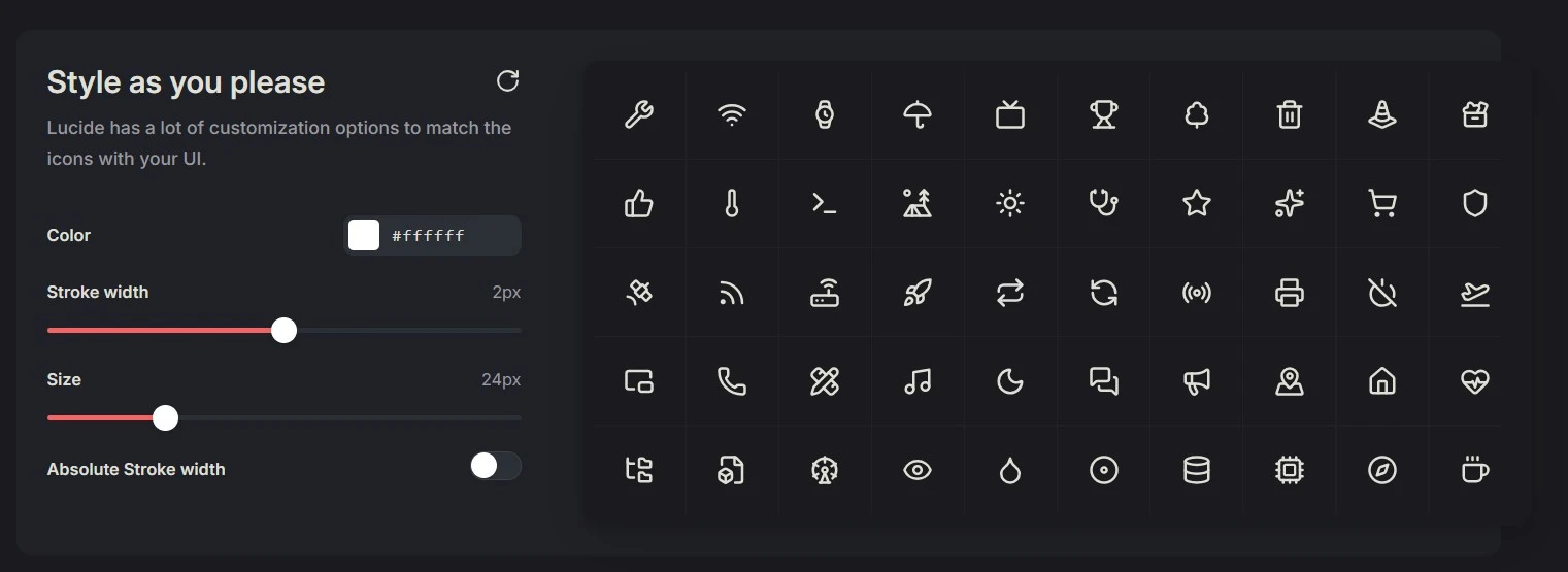
Lucide picks up right where Feather left off, carrying forward that same clean, minimal spirit while giving it room to grow. Born as a community-maintained fork, it has blossomed into a collection of well over 1,500 icons, each drawn with the consistent stroke and quiet elegance that made its predecessor a designer favorite. If you love interfaces that feel light and uncluttered, Lucide speaks your language.
What makes Lucide such a dependable companion is its adaptability. Every icon is fully customizable in size, color, and stroke width, so you can shape each one to sit naturally within your project's visual identity. Released under the permissive ISC license, it's free for both personal and commercial work, with no strings attached.
Lucide also travels well across your toolkit. Beyond crisp SVGs, it ships as ready-to-use packages for React, Vue, Svelte, Angular, and Flutter, along with a Figma plugin that drops icons straight into your design files. For modern interfaces and growing design systems, it's a set worth reaching for again and again.
Phosphor Icons
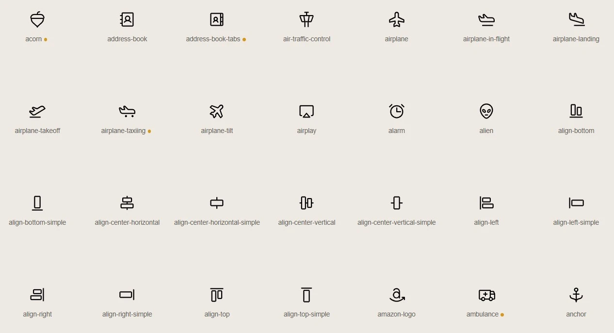
Phosphor Icons is a flexible icon family crafted for designers who love having options. At its heart sits a collection of around 1,200 icons, but the real magic is that each one arrives in six distinct weights – thin, light, regular, bold, fill, and duotone. That single detail turns one library into a remarkably expressive toolkit, letting you move from the most delicate interface hint to a bold, confident statement without ever leaving the family.
This range makes Phosphor a natural fit for products that need to feel cohesive across many moods and contexts. Whether you're refining a subtle settings menu or designing eye-catching marketing visuals, the shared design language keeps everything in harmony.
Offered under the MIT license, Phosphor is free to use wherever your work takes you, and it slots neatly into web, React, Vue, and Flutter projects, with a Figma file ready for designers. For teams building design systems that value consistency and long-term flexibility, it's a genuine standout.
Tabler Icons
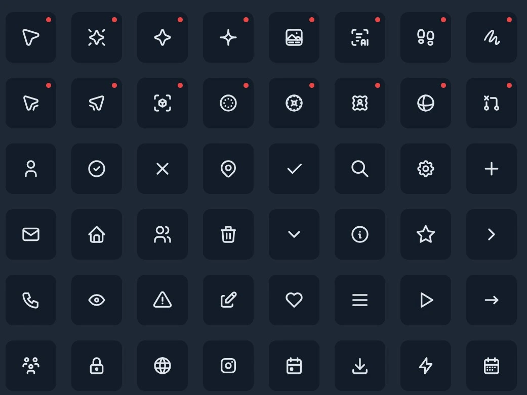
Tabler Icons feels right at home wherever information gets dense – dashboards, admin panels, and data-rich screens where clarity is everything. It offers thousands of pixel-perfect icons in both outline and filled styles, all drawn on a consistent grid so nothing ever looks out of place. That harmony is the quiet secret here: a tiny status indicator, a toolbar action, and a full navigation menu all share the same visual rhythm, keeping even the busiest interface calm and intentional.
True to the needs of designers and developers alike, Tabler invites customization at every turn, letting you adjust color, size, and stroke weight until each icon feels unmistakably yours.
Released under the MIT license, it's free for personal and commercial projects, and with ready support for web, React, and Vue, it settles comfortably into your workflow – whether you're sketching an early layout or shipping polished production UI.
Remix Icon
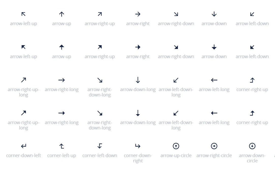
Remix Icon takes a quieter, more neutral approach – the kind of set that supports your design without ever competing with it for attention. With a library of roughly 2,800 icons drawn in matching line and filled styles, it hands you a natural pair for almost every action, object, and state you'll reach for, so your interface stays coherent as it grows.
The beauty of Remix Icon lies in its discipline. Every icon is shaped by a single, careful design language, which means you can mix and match freely and never worry about one symbol looking like it wandered in from somewhere else. You're free to recolor, resize, and refine each one to match your project's personality.
Made available under the Apache 2.0 license, it's a dependable choice for teams that care about both polish and clear usage rights. When you want icons that simply get out of the way and let your content lead, Remix Icon is a set worth keeping close.
Iconoir
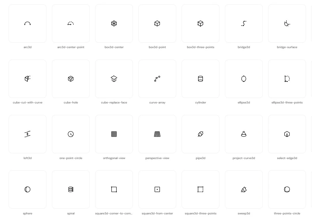
If you'd rather never run out of options, Iconoir opens the door to one of the largest open-source collections around – a sprawling, handcrafted set with no sign-ups, no email walls, and no premium tiers to work around. Everything is genuinely free under the MIT license, which makes it an easy pick for designers who want sheer breadth without the fine print.
What truly sets Iconoir apart is how far it reaches beyond the browser. Alongside clean, scalable SVGs, it ships with support for React, React Native, Flutter, Figma, and Framer, so a single icon language can follow your project from a web app to a mobile screen to your design file. The style stays consistent across that entire range – light, modern, and refreshingly uncluttered.
That combination of scale and versatility makes Iconoir especially handy when one product spans several platforms at once. When variety and flexibility matter most, it gives you all the room you need to explore.
Upgrade Your Designs with Ease
Enhance your design with this curated repository of open-source icons, injecting creativity and efficiency into your projects. By bookmarking this blog, you secure a quick gateway to a diverse array of icons, ensuring that your designs not only captivate visually but also streamline your workflow.
For those leveraging MockFlow as their UI design tool, the convenience reaches new heights. You can easily access a vast collection of icons directly within MockFlow's wireframing editor. No more tedious downloads and uploads – simply elevate your design process seamlessly.
If you're not yet exploring the advantages of MockFlow, the incentives extend far beyond access to these icons. Better yet, you don't have to leave your workflow to use them. Inside MockFlow's WireframePro editor, you get thousands of built-in icons from packs like Font Awesome, Material, and Bootstrap, ready to drag straight into your wireframes alongside UI kits, illustrations, and images.
